User login
The Cause of All That Stress: Tonsillectomy?
This transcript has been edited for clarity.
You know those times in your life when you’re just feeling ... stressed? You’re on the edge; you have no chill; everything just sort of gets to you. If you can step away from the anxiety for a moment, you might ask yourself where it’s all coming from. Is it really the stuff in your inbox at work or is it money issues at home? Is it something with your relationship, or maybe it’s your sleep quality or your diet? One thing you probably won’t blame for those acute stress reactions is the tonsillectomy you had as a kid. But according to new research, maybe you should.
Tonsillectomy and adenoidectomy are among the most common surgical procedures young people in the United States undergo, with about 300,000 cases a year, according to recent numbers. That’s down a bit from numbers a decade or so ago, but suffice it to say, a good chunk of the population is walking around right now without their tonsils.
The data supporting tonsillectomy have never been great. The two big indications for the surgery are recurrent sore throat — data show that tonsillectomy reduces this by about 0.7 sore throats per year— and obstructive sleep apnea (OSA). The data for improvement of OSA are a bit better than the data for sore throats.
Also, tonsillectomy is a relatively quick, relatively well-reimbursed surgery with indications that are — let’s be honest — somewhat subjective, and so variation is high. One study found that in a single Vermont town, nearly 60% of the population had had their tonsils removed by the time they turned 18. A few towns over, the rate was 20%.
A few factors have led to the decline of tonsillectomy in recent years. Reimbursement rates have gone down a bit. Additionally, better data collection and statistical analysis have shown that the benefits of the procedure are relatively modest.
And then there is a body of medical literature that at first struck me as surprising and almost bizarre: data linking tonsillectomy to subsequent physical and psychiatric disorders.
I teach a course on interpretation of the medical literature, and one of the first things I teach my students is to check their gut when they see the conclusion of a study.
Basically, even before you read the data, have a sense in your own mind if the hypothesis seems reasonable. If a paper is going to conclude that smoking leads to increased risk for bone cancer, I’d say that seems like a reasonable thing to study. If a paper purports to show a link between eating poultry and bone cancer, I’m going to be reading it with quite a bit more skepticism.
The technical term for that process is assessing “biologic plausibility.” If we’re talking tonsils, we have to ask ourselves: Is it plausible that removing someone’s tonsils when they are young should lead to major problems in the future?
At first blush, it didn’t seem very plausible to me.
But the truth is, there are quite a few studies out there demonstrating links like this: links between tonsillectomy and irritable bowel syndrome; links between tonsillectomy and cancer; links between tonsillectomy and depression.
And this week, appearing in JAMA Network Open, is a study linking tonsillectomy with stress disorders.
Researchers leveraged Sweden’s health database, which contains longitudinal data on basically every person who has lived in Sweden since 1981. This database let them know who had a tonsillectomy or adenoidectomy, and when, and what happened to them later in life.
I think the best way to present these data is to show you what they found, and then challenge that finding, and then show you what they did in anticipation of the challenges we would have to their findings. It’s a pretty thorough study.
So, topline results here. The researchers first identified 83,957 individuals who had their tonsils removed. They matched each of them with 10 controls who did not have their tonsils removed but were the same age and sex.
Over around 30 years of follow-up, those people who had their tonsils removed were 43% more likely to develop a stress-related disorder. Among the specific disorders, the risk for PTSD was substantially higher: 55% higher in the tonsillectomy group.
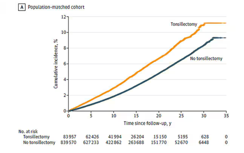
That’s pretty surprising, but I bet you already want to push back against this. Sure, the control group was the same age and sex, but other factors might be different between the two groups. You’d be right to think so. People who got their tonsils out were more likely to have parents with a history of stress-related disorders and who had lower educational attainment. But the primary results were adjusted for those factors.
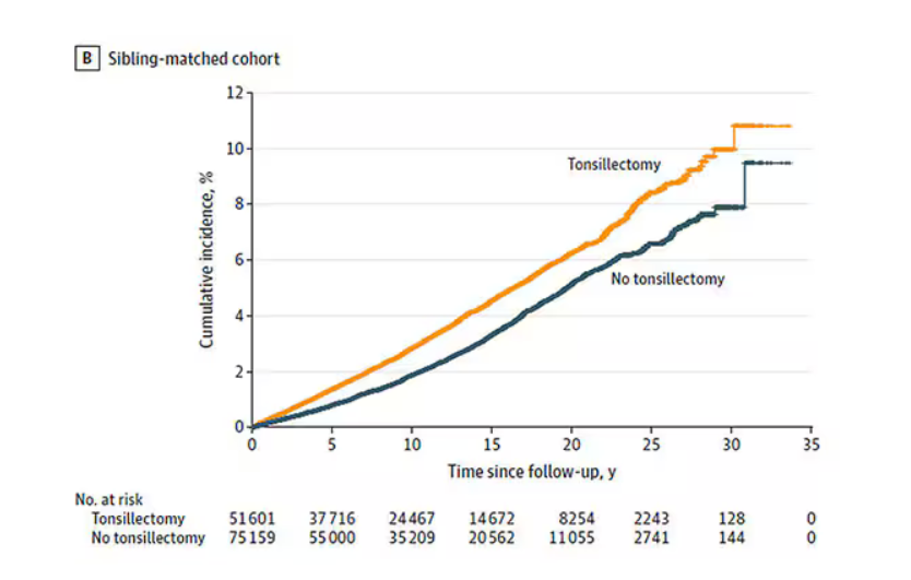
There’s more to a family than parental educational attainment, of course. To account for household factors that might be harder to measure, the researchers created a second control group, this one comprising the siblings of people who had their tonsils removed but who hadn’t themselves had their tonsils removed.
The relationship between tonsillectomy and stress disorders in this population was not quite as robust but still present: a 34% increase in any stress disorder and a 41% increase in the risk for PTSD.
Maybe kids who get their tonsils out are just followed more closely thereafter, so doctors might notice a stress disorder and document it in the medical record; whereas with other kids it might go unnoticed. This is known as ascertainment bias. The researchers addressed this in a sensitivity analysis where they excluded new diagnoses of stress disorders that occurred in the first 3 years after tonsillectomy. The results were largely unchanged.
So how do we explain these data? We observe a correlation between tonsillectomy in youth and stress disorders in later life. But correlation is not causation. One possibility, perhaps even the most likely possibility, is that tonsillectomy is a marker of some other problem. Maybe these kids are more prone to infections and are therefore more likely to need their tonsils removed. Then, after a lifetime of more infections than average, their stress responses are higher. Or maybe kids with a higher BMI are more likely to have their tonsils removed due to sleep apnea concerns, and it’s that elevated BMI that leads to higher stress in later life.
Or maybe this is causal. Maybe there actually is biological plausibility here. The authors suggest that removal of tonsils might lead to broader changes in the immune system; after all, tonsillar tissue is on the front line of our defense against pathogens that might enter our bodies through our mouths or noses. Immunologic changes lead to greater inflammation over time, and there is decent evidence to link chronic inflammation to a variety of physical and psychological disorders.
In support of this, the authors show that the kids with tonsillectomy were more likely to be hospitalized for an infectious disease in the future as well, in magnitudes similar to the increased risk for stress. But they don’t actually show that the relationship between tonsillectomy and stress is mediated by that increased risk for infectious disease.
In the end, I find these data really intriguing. Before I dug into the literature, it seemed highly unlikely that removal of these small lumps of tissue would have much of an effect on anything. Now I’m not so sure. A few things can be removed from the human body without any consequences, but it can be hard to know exactly what those consequences are.
That said, given the rather marginal benefits of tonsillectomy and the growing number of studies expanding on the risks, I expect that we’ll see the rates of the surgery decline even further in the future.
F. Perry Wilson, MD, MSCE, is an associate professor of medicine and public health and director of Yale’s Clinical and Translational Research Accelerator in New Haven, Connecticut. He reported no relevant conflicts of interest.
A version of this article first appeared on Medscape.com.
This transcript has been edited for clarity.
You know those times in your life when you’re just feeling ... stressed? You’re on the edge; you have no chill; everything just sort of gets to you. If you can step away from the anxiety for a moment, you might ask yourself where it’s all coming from. Is it really the stuff in your inbox at work or is it money issues at home? Is it something with your relationship, or maybe it’s your sleep quality or your diet? One thing you probably won’t blame for those acute stress reactions is the tonsillectomy you had as a kid. But according to new research, maybe you should.
Tonsillectomy and adenoidectomy are among the most common surgical procedures young people in the United States undergo, with about 300,000 cases a year, according to recent numbers. That’s down a bit from numbers a decade or so ago, but suffice it to say, a good chunk of the population is walking around right now without their tonsils.
The data supporting tonsillectomy have never been great. The two big indications for the surgery are recurrent sore throat — data show that tonsillectomy reduces this by about 0.7 sore throats per year— and obstructive sleep apnea (OSA). The data for improvement of OSA are a bit better than the data for sore throats.
Also, tonsillectomy is a relatively quick, relatively well-reimbursed surgery with indications that are — let’s be honest — somewhat subjective, and so variation is high. One study found that in a single Vermont town, nearly 60% of the population had had their tonsils removed by the time they turned 18. A few towns over, the rate was 20%.
A few factors have led to the decline of tonsillectomy in recent years. Reimbursement rates have gone down a bit. Additionally, better data collection and statistical analysis have shown that the benefits of the procedure are relatively modest.
And then there is a body of medical literature that at first struck me as surprising and almost bizarre: data linking tonsillectomy to subsequent physical and psychiatric disorders.
I teach a course on interpretation of the medical literature, and one of the first things I teach my students is to check their gut when they see the conclusion of a study.
Basically, even before you read the data, have a sense in your own mind if the hypothesis seems reasonable. If a paper is going to conclude that smoking leads to increased risk for bone cancer, I’d say that seems like a reasonable thing to study. If a paper purports to show a link between eating poultry and bone cancer, I’m going to be reading it with quite a bit more skepticism.
The technical term for that process is assessing “biologic plausibility.” If we’re talking tonsils, we have to ask ourselves: Is it plausible that removing someone’s tonsils when they are young should lead to major problems in the future?
At first blush, it didn’t seem very plausible to me.
But the truth is, there are quite a few studies out there demonstrating links like this: links between tonsillectomy and irritable bowel syndrome; links between tonsillectomy and cancer; links between tonsillectomy and depression.
And this week, appearing in JAMA Network Open, is a study linking tonsillectomy with stress disorders.
Researchers leveraged Sweden’s health database, which contains longitudinal data on basically every person who has lived in Sweden since 1981. This database let them know who had a tonsillectomy or adenoidectomy, and when, and what happened to them later in life.
I think the best way to present these data is to show you what they found, and then challenge that finding, and then show you what they did in anticipation of the challenges we would have to their findings. It’s a pretty thorough study.
So, topline results here. The researchers first identified 83,957 individuals who had their tonsils removed. They matched each of them with 10 controls who did not have their tonsils removed but were the same age and sex.
Over around 30 years of follow-up, those people who had their tonsils removed were 43% more likely to develop a stress-related disorder. Among the specific disorders, the risk for PTSD was substantially higher: 55% higher in the tonsillectomy group.
That’s pretty surprising, but I bet you already want to push back against this. Sure, the control group was the same age and sex, but other factors might be different between the two groups. You’d be right to think so. People who got their tonsils out were more likely to have parents with a history of stress-related disorders and who had lower educational attainment. But the primary results were adjusted for those factors.
There’s more to a family than parental educational attainment, of course. To account for household factors that might be harder to measure, the researchers created a second control group, this one comprising the siblings of people who had their tonsils removed but who hadn’t themselves had their tonsils removed.
The relationship between tonsillectomy and stress disorders in this population was not quite as robust but still present: a 34% increase in any stress disorder and a 41% increase in the risk for PTSD.
Maybe kids who get their tonsils out are just followed more closely thereafter, so doctors might notice a stress disorder and document it in the medical record; whereas with other kids it might go unnoticed. This is known as ascertainment bias. The researchers addressed this in a sensitivity analysis where they excluded new diagnoses of stress disorders that occurred in the first 3 years after tonsillectomy. The results were largely unchanged.
So how do we explain these data? We observe a correlation between tonsillectomy in youth and stress disorders in later life. But correlation is not causation. One possibility, perhaps even the most likely possibility, is that tonsillectomy is a marker of some other problem. Maybe these kids are more prone to infections and are therefore more likely to need their tonsils removed. Then, after a lifetime of more infections than average, their stress responses are higher. Or maybe kids with a higher BMI are more likely to have their tonsils removed due to sleep apnea concerns, and it’s that elevated BMI that leads to higher stress in later life.
Or maybe this is causal. Maybe there actually is biological plausibility here. The authors suggest that removal of tonsils might lead to broader changes in the immune system; after all, tonsillar tissue is on the front line of our defense against pathogens that might enter our bodies through our mouths or noses. Immunologic changes lead to greater inflammation over time, and there is decent evidence to link chronic inflammation to a variety of physical and psychological disorders.
In support of this, the authors show that the kids with tonsillectomy were more likely to be hospitalized for an infectious disease in the future as well, in magnitudes similar to the increased risk for stress. But they don’t actually show that the relationship between tonsillectomy and stress is mediated by that increased risk for infectious disease.
In the end, I find these data really intriguing. Before I dug into the literature, it seemed highly unlikely that removal of these small lumps of tissue would have much of an effect on anything. Now I’m not so sure. A few things can be removed from the human body without any consequences, but it can be hard to know exactly what those consequences are.
That said, given the rather marginal benefits of tonsillectomy and the growing number of studies expanding on the risks, I expect that we’ll see the rates of the surgery decline even further in the future.
F. Perry Wilson, MD, MSCE, is an associate professor of medicine and public health and director of Yale’s Clinical and Translational Research Accelerator in New Haven, Connecticut. He reported no relevant conflicts of interest.
A version of this article first appeared on Medscape.com.
How Metals Affect the Brain
This transcript has been edited for clarity.
It has always amazed me that our bodies require these tiny amounts of incredibly rare substances to function. Sure, we need oxygen. We need water. But we also need molybdenum, which makes up just 1.2 parts per million of the Earth’s crust.
Without adequate molybdenum intake, we develop seizures, developmental delays, death. Fortunately, we need so little molybdenum that true molybdenum deficiency is incredibly rare — seen only in people on total parenteral nutrition without supplementation or those with certain rare genetic conditions. But still, molybdenum is necessary for life.
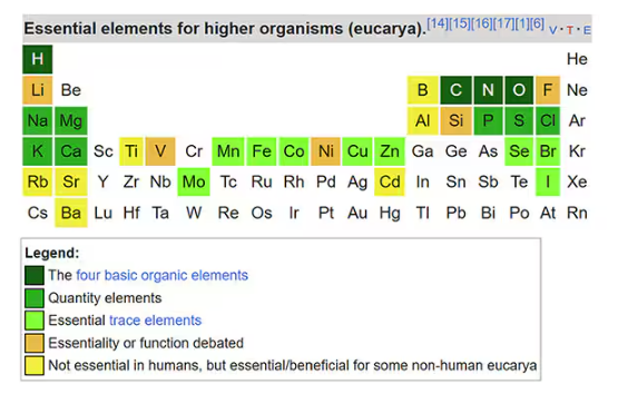
Many metals are. Figure 1 colors the essential minerals on the periodic table. You can see that to stay alive, we humans need not only things like sodium, but selenium, bromine, zinc, copper, and cobalt.
Some metals are very clearly not essential; we can all do without lead and mercury, and probably should.
But just because something is essential for life does not mean that more is better. The dose is the poison, as they say. And this week, we explore whether metals — even essential metals — might be adversely affecting our brains.
It’s not a stretch to think that metal intake could have weird effects on our nervous system. Lead exposure, primarily due to leaded gasoline, has been blamed for an average reduction of about 3 points in our national IQ, for example . But not all metals are created equal. Researchers set out to find out which might be more strongly associated with performance on cognitive tests and dementia, and reported their results in this study in JAMA Network Open.
To do this, they leveraged the MESA cohort study. This is a longitudinal study of a relatively diverse group of 6300 adults who were enrolled from 2000 to 2002 around the United States. At enrollment, they gave a urine sample and took a variety of cognitive tests. Important for this study was the digit symbol substitution test, where participants are provided a code and need to replace a list of numbers with symbols as per that code. Performance on this test worsens with age, depression, and cognitive impairment.
Participants were followed for more than a decade, and over that time, 559 (about 9%) were diagnosed with dementia.
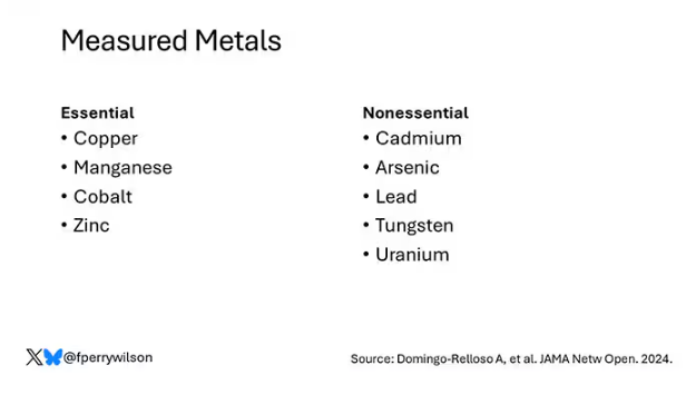
Those baseline urine samples were assayed for a variety of metals — some essential, some very much not, as you can see in Figure 2.
Now, I have to put my kidney doctor hat on for a second and talk about urine measurement ... of anything. The problem with urine is that the concentration can change a lot — by more than 10-fold, in fact — based on how much water you drank recently. Researchers correct for this, and in the case of this study, they do what a lot of researchers do: divide the measured concentration by the urine creatinine level.
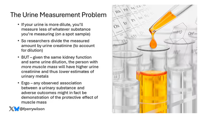
This introduces a bit of a problem. Take two people with exactly the same kidney function, who drank exactly the same water, whose urine is exactly the same concentration. The person with more muscle mass will have more creatinine in that urine sample, since creatinine is a byproduct of muscle metabolism. Because people with more muscle mass are generally healthier, when you divide your metal concentration by urine creatinine, you get a lower number, which might lead you to believe that lower levels of the metal in the urine are protective. But in fact, what you’re seeing is that higher levels of creatinine are protective. I see this issue all the time and it will always color results of studies like this.
Okay, I am doffing my kidney doctor hat now to show you the results.
The researchers first looked at the relationship between metal concentrations in the urine and performance on cognitive tests. The results were fairly equivocal, save for that digit substitution test which is shown in Figure 4.
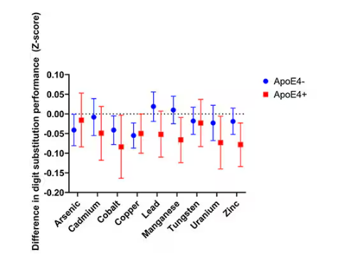
Even these results don’t ring major alarm bells for me. What you’re seeing here is the change in scores on the digit substitution test for each 25-percentile increase in urinary metal level — a pretty big change. And yet, you see really minor changes in the performance on the test. The digit substitution test is not an IQ test; but to give you a feeling for the magnitude of this change, if we looked at copper level, moving from the 25th to the 50th percentile would be associated with a loss of nine tenths of an IQ point.
You see two colors on the Figure 4 graph, by the way. That’s because the researchers stratified their findings based on whether the individual carried the ApoE4 gene allele, which is a risk factor for the development of dementia. There are reasons to believe that neurotoxic metals might be worse in this population, and I suppose you do see generally more adverse effects on scores in the red lines compared with the blue lines. But still, we’re not talking about a huge effect size here.
Let’s look at the relationship between these metals and the development of dementia itself, a clearly more important outcome than how well you can replace numeric digits with symbols. I’ll highlight a few of the results that are particularly telling.
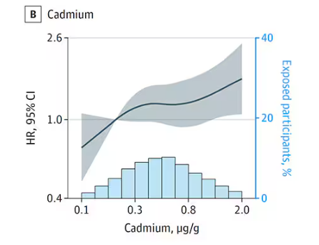
First, the nonessential mineral cadmium, which displays the type of relationship we would expect if the metal were neurotoxic: a clear, roughly linear increase in risk for dementia as urinary concentration increases.
We see roughly similar patterns with the nonessential minerals tungsten and uranium, and the essential mineral zinc (beloved of respiratory-virus avoiders everywhere).
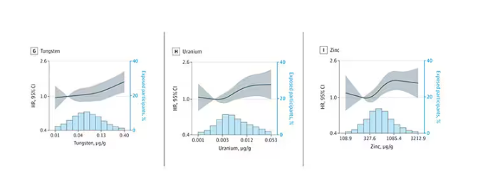
But it is very much not what we see for all metals. Strangest of all, look at lead, which shows basically no relationship with dementia.
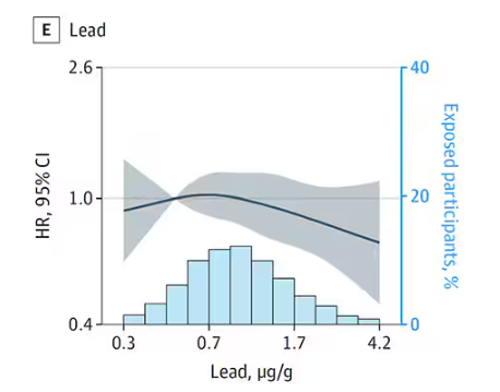
This concerns me a bit. Earlier, I discussed the issue of measuring stuff in urine and how standardizing levels to the urine creatinine level introduces a bias due to muscle mass. One way around this is to standardize urine levels to some other marker of urine dilution, like osmolality. But more fundamental than that, I like to see positive and negative controls in studies like this. For example, lead strikes me as a good positive control here. If the experimental framework were valid, I would think we’d see a relationship between lead level and dementia.
For a negative control? Well, something we are quite sure is not neurotoxic — something like sulfur, which is relatively ubiquitous, used in a variety of biological processes, and efficiently eliminated. We don’t have that in this study.
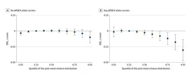
The authors close their case by creating a model that combines all the metal levels, asking the question of whether higher levels of metals in the urine in general worsen cognitive scores. And they find that the relationship exists, as you can see in Figure 8, both in carriers and noncarriers of ApoE4. But, to me, this is even more argument for the creatinine problem. If it’s not a specific metal but just the sort of general concentration of all metals, the risk for confounding by muscle mass is even higher.
So should we worry about ingesting metals? I suppose the answer is ... kind of.
I am sure we should be avoiding lead, despite the results of this study. It’s probably best to stay away from uranium too.
As for the essential metals, I’m sure there is some toxic dose; there’s a toxic dose for everything at some point. But I don’t see evidence in this study to make me worry that a significant chunk of the population is anywhere close to that.
Dr. Wilson is associate professor of medicine and public health and director of the Clinical and Translational Research Accelerator at Yale University, New Haven, Connecticut. He has disclosed no relevant financial relationships.
A version of this article appeared on Medscape.com.
This transcript has been edited for clarity.
It has always amazed me that our bodies require these tiny amounts of incredibly rare substances to function. Sure, we need oxygen. We need water. But we also need molybdenum, which makes up just 1.2 parts per million of the Earth’s crust.
Without adequate molybdenum intake, we develop seizures, developmental delays, death. Fortunately, we need so little molybdenum that true molybdenum deficiency is incredibly rare — seen only in people on total parenteral nutrition without supplementation or those with certain rare genetic conditions. But still, molybdenum is necessary for life.
Many metals are. Figure 1 colors the essential minerals on the periodic table. You can see that to stay alive, we humans need not only things like sodium, but selenium, bromine, zinc, copper, and cobalt.
Some metals are very clearly not essential; we can all do without lead and mercury, and probably should.
But just because something is essential for life does not mean that more is better. The dose is the poison, as they say. And this week, we explore whether metals — even essential metals — might be adversely affecting our brains.
It’s not a stretch to think that metal intake could have weird effects on our nervous system. Lead exposure, primarily due to leaded gasoline, has been blamed for an average reduction of about 3 points in our national IQ, for example . But not all metals are created equal. Researchers set out to find out which might be more strongly associated with performance on cognitive tests and dementia, and reported their results in this study in JAMA Network Open.
To do this, they leveraged the MESA cohort study. This is a longitudinal study of a relatively diverse group of 6300 adults who were enrolled from 2000 to 2002 around the United States. At enrollment, they gave a urine sample and took a variety of cognitive tests. Important for this study was the digit symbol substitution test, where participants are provided a code and need to replace a list of numbers with symbols as per that code. Performance on this test worsens with age, depression, and cognitive impairment.
Participants were followed for more than a decade, and over that time, 559 (about 9%) were diagnosed with dementia.
Those baseline urine samples were assayed for a variety of metals — some essential, some very much not, as you can see in Figure 2.
Now, I have to put my kidney doctor hat on for a second and talk about urine measurement ... of anything. The problem with urine is that the concentration can change a lot — by more than 10-fold, in fact — based on how much water you drank recently. Researchers correct for this, and in the case of this study, they do what a lot of researchers do: divide the measured concentration by the urine creatinine level.
This introduces a bit of a problem. Take two people with exactly the same kidney function, who drank exactly the same water, whose urine is exactly the same concentration. The person with more muscle mass will have more creatinine in that urine sample, since creatinine is a byproduct of muscle metabolism. Because people with more muscle mass are generally healthier, when you divide your metal concentration by urine creatinine, you get a lower number, which might lead you to believe that lower levels of the metal in the urine are protective. But in fact, what you’re seeing is that higher levels of creatinine are protective. I see this issue all the time and it will always color results of studies like this.
Okay, I am doffing my kidney doctor hat now to show you the results.
The researchers first looked at the relationship between metal concentrations in the urine and performance on cognitive tests. The results were fairly equivocal, save for that digit substitution test which is shown in Figure 4.
Even these results don’t ring major alarm bells for me. What you’re seeing here is the change in scores on the digit substitution test for each 25-percentile increase in urinary metal level — a pretty big change. And yet, you see really minor changes in the performance on the test. The digit substitution test is not an IQ test; but to give you a feeling for the magnitude of this change, if we looked at copper level, moving from the 25th to the 50th percentile would be associated with a loss of nine tenths of an IQ point.
You see two colors on the Figure 4 graph, by the way. That’s because the researchers stratified their findings based on whether the individual carried the ApoE4 gene allele, which is a risk factor for the development of dementia. There are reasons to believe that neurotoxic metals might be worse in this population, and I suppose you do see generally more adverse effects on scores in the red lines compared with the blue lines. But still, we’re not talking about a huge effect size here.
Let’s look at the relationship between these metals and the development of dementia itself, a clearly more important outcome than how well you can replace numeric digits with symbols. I’ll highlight a few of the results that are particularly telling.
First, the nonessential mineral cadmium, which displays the type of relationship we would expect if the metal were neurotoxic: a clear, roughly linear increase in risk for dementia as urinary concentration increases.
We see roughly similar patterns with the nonessential minerals tungsten and uranium, and the essential mineral zinc (beloved of respiratory-virus avoiders everywhere).
But it is very much not what we see for all metals. Strangest of all, look at lead, which shows basically no relationship with dementia.
This concerns me a bit. Earlier, I discussed the issue of measuring stuff in urine and how standardizing levels to the urine creatinine level introduces a bias due to muscle mass. One way around this is to standardize urine levels to some other marker of urine dilution, like osmolality. But more fundamental than that, I like to see positive and negative controls in studies like this. For example, lead strikes me as a good positive control here. If the experimental framework were valid, I would think we’d see a relationship between lead level and dementia.
For a negative control? Well, something we are quite sure is not neurotoxic — something like sulfur, which is relatively ubiquitous, used in a variety of biological processes, and efficiently eliminated. We don’t have that in this study.
The authors close their case by creating a model that combines all the metal levels, asking the question of whether higher levels of metals in the urine in general worsen cognitive scores. And they find that the relationship exists, as you can see in Figure 8, both in carriers and noncarriers of ApoE4. But, to me, this is even more argument for the creatinine problem. If it’s not a specific metal but just the sort of general concentration of all metals, the risk for confounding by muscle mass is even higher.
So should we worry about ingesting metals? I suppose the answer is ... kind of.
I am sure we should be avoiding lead, despite the results of this study. It’s probably best to stay away from uranium too.
As for the essential metals, I’m sure there is some toxic dose; there’s a toxic dose for everything at some point. But I don’t see evidence in this study to make me worry that a significant chunk of the population is anywhere close to that.
Dr. Wilson is associate professor of medicine and public health and director of the Clinical and Translational Research Accelerator at Yale University, New Haven, Connecticut. He has disclosed no relevant financial relationships.
A version of this article appeared on Medscape.com.
How Much Water Should We Drink in a Day?
This transcript has been edited for clarity.
It’s just about the easiest, safest medical advice you can give: “Drink more water.” You have a headache? Drink more water. Tired? Drink more water. Cold coming on? Drink more water. Tom Brady famously attributed his QB longevity to water drinking, among some other less ordinary practices.
I’m a nephrologist — a kidney doctor. I think about water all the time. I can tell you how your brain senses how much water is in your body and exactly how it communicates that information to your kidneys to control how dilute your urine is. I can explain the miraculous ability of the kidney to concentrate urine across a range from 50 mOsm/L to 1200 mOsm/L and the physiology that makes it all work.

But I can’t really tell you how much water you’re supposed to drink. And believe me, I get asked all the time.
I’m sure of a couple of things when it comes to water: You need to drink some. Though some animals, such as kangaroo rats, can get virtually all the water they need from the food they eat, we are not such animals. Without water, we die. I’m also sure that you can die from drinking too much water. Drinking excessive amounts of water dilutes the sodium in your blood, which messes with the electrical system in your brain and heart. I actually had a patient who went on a “water cleanse” and gave herself a seizure.
But, to be fair, assuming your kidneys are working reasonably well and you’re otherwise healthy, you’d need to drink around 20 liters of water a day to get into mortal trouble. The dose is the poison, as they say.
So, somewhere between zero and 20 liters of water is the amount you should be drinking in a day. That much I’m sure of.
But the evidence on where in that range you should target is actually pretty skimpy. You wouldn’t think so if you look at the online wellness influencers, with their Stanleys and their strict water intake regimens. You’d think the evidence for the benefits of drinking extra water is overwhelming.
The venerated National Academy of Medicine suggests that men drink thirteen 8 oz cups a day (that’s about 3 liters) and women drink nine 8 oz cups a day (a bit more than 2 liters). From what I can tell, this recommendation — like the old “8 cups of water per day” recommendation — is pulled out of thin air.
I’m not arguing that we shouldn’t drink water. Of course, water is important. I’m just wondering what data there are to really prove that drinking more water is better.
Fortunately, a team from UCSF has finally done the legwork for us. They break down the actual evidence in this paper, appearing in JAMA Network Open.
The team scoured the medical literature for randomized controlled trials of water intake. This is critical; we don’t want anecdotes about how clear someone’s skin became after they increased their water intake. We want icy cold, clear data. Randomized trials take a group of people and, at random, assign some to the intervention — in this case, drinking more water — and others to keep doing what they would normally do.

The team reviewed nearly 1500 papers but only 18 (!) met the rigorous criteria to be included in the analysis, as you can see from this flow chart.

This is the first important finding; not many high-quality studies have investigated how much water we should drink. Of course, water isn’t a prescription product, so funding is likely hard to come by. Can we do a trial of Dasani?
In any case, these 18 trials all looked at different outcomes of interest. Four studies looked at the impact of drinking more water on weight loss, two on fasting blood glucose, two on headache, two on urinary tract infection, two on kidney stones, and six studies on various other outcomes. None of the studies looked at energy, skin tone, or overall wellness, though one did measure a quality-of-life score.
And if I could sum up all these studies in a word, that word would be “meh.”

One of four weight loss studies showed that increasing water intake had no effect on weight loss. Two studies showed an effect, but drinking extra water was combined with a low-calorie diet, so that feels a bit like cheating to me. One study randomized participants to drink half a liter of water before meals, and that group did lose more weight than the control group — about a kilogram more over 12 weeks. That’s not exactly Ozempic.
For fasting blood glucose, although one trial suggested that higher premeal water intake lowered glucose levels, the other study (which looked just at increasing water overall) didn’t.
For headache — and, cards on the table here, I’m a big believer in water for headaches — one study showed nothing. The other showed that increasing water intake by 1.5 liters per day improved migraine-related quality of life but didn’t change the number of headache days per month.
For urinary tract infections, one positive trial and one negative one.
The best evidence comes from the kidney stone trials. Increasing water intake to achieve more than two liters of urine a day was associated with a significant reduction in kidney stone recurrence. I consider this a positive finding, more or less. You would be hard-pressed to find a kidney doctor who doesn’t think that people with a history of kidney stones should drink more water.
What about that quality-of-life study? They randomized participants to either drink 1.5 liters of extra water per day (intervention group) or not (control group). Six months later, the scores on the quality-of-life survey were no different between those two groups.
Thirsty yet?
So, what’s going on here? There are a few possibilities.
First, I need to point out that clinical trials are really hard. All the studies in this review were relatively small, with most enrolling fewer than 100 people. The effect of extra water would need to be pretty potent to detect it with those small samples.
I can’t help but point out that our bodies are actually exquisitely tuned to manage how much water we carry. As we lose water throughout the day from sweat and exhalation, our blood becomes a tiny bit more concentrated — the sodium level goes up. Our brains detect that and create a sensation we call thirst. Thirst is one of the most powerful drives we have. Animals, including humans, when thirsty, will choose water over food, over drugs, and over sex. It is incredibly hard to resist, and assuming that we have ready access to water, there is no need to resist it. We drink when we are thirsty. And that may be enough.
Of course, pushing beyond thirst is possible. We are sapient beings who can drink more than we want to. But what we can’t do, assuming our kidneys work, is hold onto that water. It passes right through us. In the case of preventing kidney stones, this is a good thing. Putting more water into your body leads to more water coming out — more dilute urine — which means it’s harder for stones to form.
But for all that other stuff? The wellness, the skin tone, and so on? It just doesn’t make much sense. If you drink an extra liter of water, you pee an extra liter of water. Net net? Zero.
Some folks will argue that the extra pee gets rid of extra toxins or something like that, but — sorry, kidney doctor Perry here again — that’s not how pee works. The clearance of toxins from the blood happens way upstream of where your urine is diluted or concentrated.

If you drink more, the same toxins come out, just with more water around them. In fact, one of the largest studies in this JAMA Network Open review assessed whether increasing water consumption in people with chronic kidney disease would improve kidney function. It didn’t.
I am left, then, with only a bit more confidence than when I began. Beyond that, it seems reasonable to trust the millions of years of evolution that have made water homeostasis central to life itself. Give yourself access to water. Drink when you’re thirsty. Drink a bit more if you’d like. But no need to push it. Your kidneys won’t let you anyway.
F. Perry Wilson, MD, MSCE, is an associate professor of medicine and public health and director of Yale’s Clinical and Translational Research Accelerator in New Haven, Connecticut. He disclosed no relevant conflicts of interest.
A version of this article first appeared on Medscape.com.
This transcript has been edited for clarity.
It’s just about the easiest, safest medical advice you can give: “Drink more water.” You have a headache? Drink more water. Tired? Drink more water. Cold coming on? Drink more water. Tom Brady famously attributed his QB longevity to water drinking, among some other less ordinary practices.
I’m a nephrologist — a kidney doctor. I think about water all the time. I can tell you how your brain senses how much water is in your body and exactly how it communicates that information to your kidneys to control how dilute your urine is. I can explain the miraculous ability of the kidney to concentrate urine across a range from 50 mOsm/L to 1200 mOsm/L and the physiology that makes it all work.
But I can’t really tell you how much water you’re supposed to drink. And believe me, I get asked all the time.
I’m sure of a couple of things when it comes to water: You need to drink some. Though some animals, such as kangaroo rats, can get virtually all the water they need from the food they eat, we are not such animals. Without water, we die. I’m also sure that you can die from drinking too much water. Drinking excessive amounts of water dilutes the sodium in your blood, which messes with the electrical system in your brain and heart. I actually had a patient who went on a “water cleanse” and gave herself a seizure.
But, to be fair, assuming your kidneys are working reasonably well and you’re otherwise healthy, you’d need to drink around 20 liters of water a day to get into mortal trouble. The dose is the poison, as they say.
So, somewhere between zero and 20 liters of water is the amount you should be drinking in a day. That much I’m sure of.
But the evidence on where in that range you should target is actually pretty skimpy. You wouldn’t think so if you look at the online wellness influencers, with their Stanleys and their strict water intake regimens. You’d think the evidence for the benefits of drinking extra water is overwhelming.
The venerated National Academy of Medicine suggests that men drink thirteen 8 oz cups a day (that’s about 3 liters) and women drink nine 8 oz cups a day (a bit more than 2 liters). From what I can tell, this recommendation — like the old “8 cups of water per day” recommendation — is pulled out of thin air.
I’m not arguing that we shouldn’t drink water. Of course, water is important. I’m just wondering what data there are to really prove that drinking more water is better.
Fortunately, a team from UCSF has finally done the legwork for us. They break down the actual evidence in this paper, appearing in JAMA Network Open.
The team scoured the medical literature for randomized controlled trials of water intake. This is critical; we don’t want anecdotes about how clear someone’s skin became after they increased their water intake. We want icy cold, clear data. Randomized trials take a group of people and, at random, assign some to the intervention — in this case, drinking more water — and others to keep doing what they would normally do.
The team reviewed nearly 1500 papers but only 18 (!) met the rigorous criteria to be included in the analysis, as you can see from this flow chart.
This is the first important finding; not many high-quality studies have investigated how much water we should drink. Of course, water isn’t a prescription product, so funding is likely hard to come by. Can we do a trial of Dasani?
In any case, these 18 trials all looked at different outcomes of interest. Four studies looked at the impact of drinking more water on weight loss, two on fasting blood glucose, two on headache, two on urinary tract infection, two on kidney stones, and six studies on various other outcomes. None of the studies looked at energy, skin tone, or overall wellness, though one did measure a quality-of-life score.
And if I could sum up all these studies in a word, that word would be “meh.”
One of four weight loss studies showed that increasing water intake had no effect on weight loss. Two studies showed an effect, but drinking extra water was combined with a low-calorie diet, so that feels a bit like cheating to me. One study randomized participants to drink half a liter of water before meals, and that group did lose more weight than the control group — about a kilogram more over 12 weeks. That’s not exactly Ozempic.
For fasting blood glucose, although one trial suggested that higher premeal water intake lowered glucose levels, the other study (which looked just at increasing water overall) didn’t.
For headache — and, cards on the table here, I’m a big believer in water for headaches — one study showed nothing. The other showed that increasing water intake by 1.5 liters per day improved migraine-related quality of life but didn’t change the number of headache days per month.
For urinary tract infections, one positive trial and one negative one.
The best evidence comes from the kidney stone trials. Increasing water intake to achieve more than two liters of urine a day was associated with a significant reduction in kidney stone recurrence. I consider this a positive finding, more or less. You would be hard-pressed to find a kidney doctor who doesn’t think that people with a history of kidney stones should drink more water.
What about that quality-of-life study? They randomized participants to either drink 1.5 liters of extra water per day (intervention group) or not (control group). Six months later, the scores on the quality-of-life survey were no different between those two groups.
Thirsty yet?
So, what’s going on here? There are a few possibilities.
First, I need to point out that clinical trials are really hard. All the studies in this review were relatively small, with most enrolling fewer than 100 people. The effect of extra water would need to be pretty potent to detect it with those small samples.
I can’t help but point out that our bodies are actually exquisitely tuned to manage how much water we carry. As we lose water throughout the day from sweat and exhalation, our blood becomes a tiny bit more concentrated — the sodium level goes up. Our brains detect that and create a sensation we call thirst. Thirst is one of the most powerful drives we have. Animals, including humans, when thirsty, will choose water over food, over drugs, and over sex. It is incredibly hard to resist, and assuming that we have ready access to water, there is no need to resist it. We drink when we are thirsty. And that may be enough.
Of course, pushing beyond thirst is possible. We are sapient beings who can drink more than we want to. But what we can’t do, assuming our kidneys work, is hold onto that water. It passes right through us. In the case of preventing kidney stones, this is a good thing. Putting more water into your body leads to more water coming out — more dilute urine — which means it’s harder for stones to form.
But for all that other stuff? The wellness, the skin tone, and so on? It just doesn’t make much sense. If you drink an extra liter of water, you pee an extra liter of water. Net net? Zero.
Some folks will argue that the extra pee gets rid of extra toxins or something like that, but — sorry, kidney doctor Perry here again — that’s not how pee works. The clearance of toxins from the blood happens way upstream of where your urine is diluted or concentrated.
If you drink more, the same toxins come out, just with more water around them. In fact, one of the largest studies in this JAMA Network Open review assessed whether increasing water consumption in people with chronic kidney disease would improve kidney function. It didn’t.
I am left, then, with only a bit more confidence than when I began. Beyond that, it seems reasonable to trust the millions of years of evolution that have made water homeostasis central to life itself. Give yourself access to water. Drink when you’re thirsty. Drink a bit more if you’d like. But no need to push it. Your kidneys won’t let you anyway.
F. Perry Wilson, MD, MSCE, is an associate professor of medicine and public health and director of Yale’s Clinical and Translational Research Accelerator in New Haven, Connecticut. He disclosed no relevant conflicts of interest.
A version of this article first appeared on Medscape.com.
We Haven’t Kicked Our Pandemic Drinking Habit
This transcript has been edited for clarity.
You’re stuck in your house. Work is closed or you’re working remotely. Your kids’ school is closed or is offering an hour or two a day of Zoom-based instruction. You have a bit of cabin fever which, you suppose, is better than the actual fever that comes with COVID infections, which are running rampant during the height of the pandemic. But still — it’s stressful. What do you do?
We all coped in our own way. We baked sourdough bread. We built that tree house we’d been meaning to build. We started podcasts. And ... we drank. Quite a bit, actually.
During the first year of the pandemic, alcohol sales increased 3%, the largest year-on-year increase in more than 50 years. There was also an increase in drunkenness across the board, though it was most pronounced in those who were already at risk from alcohol use disorder.
Alcohol-associated deaths increased by around 10% from 2019 to 2020. Obviously, this is a small percentage of COVID-associated deaths, but it is nothing to sneeze at.
But look, we were anxious. And say what you will about alcohol as a risk factor for liver disease, heart disease, and cancer — not to mention traffic accidents — it is an anxiolytic, at least in the short term.
But as the pandemic waned, as society reopened, as we got back to work and reintegrated into our social circles and escaped the confines of our houses and apartments, our drinking habits went back to normal, right?
Americans’ love affair with alcohol has been a torrid one, as this graph showing gallons of ethanol consumed per capita over time shows you.
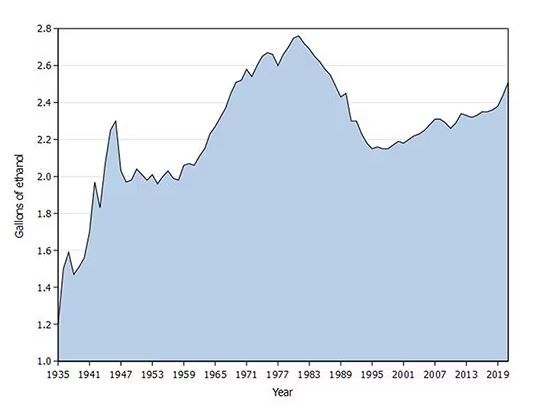
What you see is a steady increase in alcohol consumption from the end of prohibition in 1933 to its peak in the heady days of the early 1980s, followed by a steady decline until the mid-1990s. Since then, there has been another increase with, as you will note, a notable uptick during the early part of the COVID pandemic.
What came across my desk this week was updated data, appearing in a research letter in Annals of Internal Medicine, that compared alcohol consumption in 2020 — the first year of the COVID pandemic — with that in 2022 (the latest available data). And it looks like not much has changed.
This was a population-based survey study leveraging the National Health Interview Survey, including around 80,000 respondents from 2018, 2020, and 2022.
They created two main categories of drinking: drinking any alcohol at all and heavy drinking.
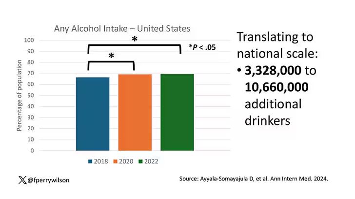
In 2018, 66% of Americans reported drinking any alcohol. That had risen to 69% by 2020, and it stayed at that level even after the lockdown had ended, as you can see here. This may seem like a small increase, but this was a highly significant result. Translating into absolute numbers, it suggests that we have added between 3,328,000 and 10,660,000 net additional drinkers to the population over this time period.
This trend was seen across basically every demographic group, with some notably larger increases among Black and Hispanic individuals, and marginally higher rates among people under age 30.
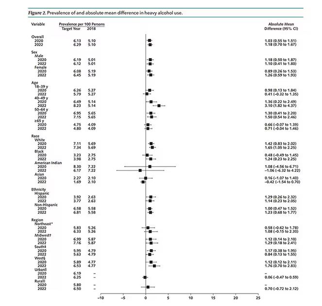
But far be it from me to deny someone a tot of brandy on a cold winter’s night. More interesting is the rate of heavy alcohol use reported in the study. For context, the definitions of heavy alcohol use appear here. For men, it’s any one day with five or more drinks or 15 or more drinks per week. For women it’s four or more drinks on a given day or eight drinks or more per week.
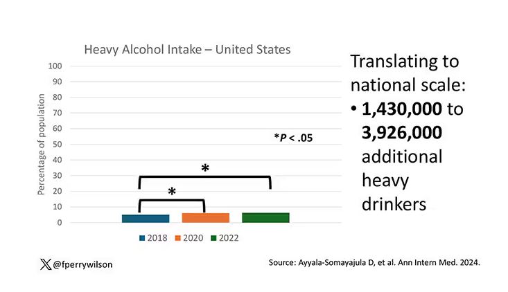
The overall rate of heavy drinking was about 5.1% in 2018 before the start of the pandemic. That rose to more than 6% in 2020 and it rose a bit more into 2022. The net change here, on a population level, is from 1,430,000 to 3,926,000 new heavy drinkers. That’s a number that rises to the level of an actual public health issue.
Again, this trend was fairly broad across demographic groups. Although in this case, the changes were a bit larger among White people and those in the 40- to 49-year age group. This is my cohort, I guess. Cheers.
The information we have from this study is purely descriptive. It tells us that people are drinking more since the pandemic. It doesn’t tell us why, or the impact that this excess drinking will have on subsequent health outcomes, although other studies would suggest that it will contribute to certain chronic conditions, both physical and mental.
Maybe more important is that it reminds us that habits are sticky. Once we become accustomed to something — that glass of wine or two with dinner, and before bed — it has a tendency to stay with us. There’s an upside to that phenomenon as well, of course; it means that we can train good habits too. And those, once they become ingrained, can be just as hard to break. We just need to be mindful of the habits we pick. New Year 2025 is just around the corner. Start brainstorming those resolutions now.
Wilson is associate professor of medicine and public health and director of the Clinical and Translational Research Accelerator at Yale University, New Haven, Conn. He has disclosed no relevant financial relationships.
A version of this article appeared on Medscape.com.
This transcript has been edited for clarity.
You’re stuck in your house. Work is closed or you’re working remotely. Your kids’ school is closed or is offering an hour or two a day of Zoom-based instruction. You have a bit of cabin fever which, you suppose, is better than the actual fever that comes with COVID infections, which are running rampant during the height of the pandemic. But still — it’s stressful. What do you do?
We all coped in our own way. We baked sourdough bread. We built that tree house we’d been meaning to build. We started podcasts. And ... we drank. Quite a bit, actually.
During the first year of the pandemic, alcohol sales increased 3%, the largest year-on-year increase in more than 50 years. There was also an increase in drunkenness across the board, though it was most pronounced in those who were already at risk from alcohol use disorder.
Alcohol-associated deaths increased by around 10% from 2019 to 2020. Obviously, this is a small percentage of COVID-associated deaths, but it is nothing to sneeze at.
But look, we were anxious. And say what you will about alcohol as a risk factor for liver disease, heart disease, and cancer — not to mention traffic accidents — it is an anxiolytic, at least in the short term.
But as the pandemic waned, as society reopened, as we got back to work and reintegrated into our social circles and escaped the confines of our houses and apartments, our drinking habits went back to normal, right?
Americans’ love affair with alcohol has been a torrid one, as this graph showing gallons of ethanol consumed per capita over time shows you.
What you see is a steady increase in alcohol consumption from the end of prohibition in 1933 to its peak in the heady days of the early 1980s, followed by a steady decline until the mid-1990s. Since then, there has been another increase with, as you will note, a notable uptick during the early part of the COVID pandemic.
What came across my desk this week was updated data, appearing in a research letter in Annals of Internal Medicine, that compared alcohol consumption in 2020 — the first year of the COVID pandemic — with that in 2022 (the latest available data). And it looks like not much has changed.
This was a population-based survey study leveraging the National Health Interview Survey, including around 80,000 respondents from 2018, 2020, and 2022.
They created two main categories of drinking: drinking any alcohol at all and heavy drinking.
In 2018, 66% of Americans reported drinking any alcohol. That had risen to 69% by 2020, and it stayed at that level even after the lockdown had ended, as you can see here. This may seem like a small increase, but this was a highly significant result. Translating into absolute numbers, it suggests that we have added between 3,328,000 and 10,660,000 net additional drinkers to the population over this time period.
This trend was seen across basically every demographic group, with some notably larger increases among Black and Hispanic individuals, and marginally higher rates among people under age 30.
But far be it from me to deny someone a tot of brandy on a cold winter’s night. More interesting is the rate of heavy alcohol use reported in the study. For context, the definitions of heavy alcohol use appear here. For men, it’s any one day with five or more drinks or 15 or more drinks per week. For women it’s four or more drinks on a given day or eight drinks or more per week.
The overall rate of heavy drinking was about 5.1% in 2018 before the start of the pandemic. That rose to more than 6% in 2020 and it rose a bit more into 2022. The net change here, on a population level, is from 1,430,000 to 3,926,000 new heavy drinkers. That’s a number that rises to the level of an actual public health issue.
Again, this trend was fairly broad across demographic groups. Although in this case, the changes were a bit larger among White people and those in the 40- to 49-year age group. This is my cohort, I guess. Cheers.
The information we have from this study is purely descriptive. It tells us that people are drinking more since the pandemic. It doesn’t tell us why, or the impact that this excess drinking will have on subsequent health outcomes, although other studies would suggest that it will contribute to certain chronic conditions, both physical and mental.
Maybe more important is that it reminds us that habits are sticky. Once we become accustomed to something — that glass of wine or two with dinner, and before bed — it has a tendency to stay with us. There’s an upside to that phenomenon as well, of course; it means that we can train good habits too. And those, once they become ingrained, can be just as hard to break. We just need to be mindful of the habits we pick. New Year 2025 is just around the corner. Start brainstorming those resolutions now.
Wilson is associate professor of medicine and public health and director of the Clinical and Translational Research Accelerator at Yale University, New Haven, Conn. He has disclosed no relevant financial relationships.
A version of this article appeared on Medscape.com.
Aliens, Ian McShane, and Heart Disease Risk
This transcript has been edited for clarity.
I was really struggling to think of a good analogy to explain the glaring problem of polygenic risk scores (PRS) this week. But I think I have it now. Go with me on this.
An alien spaceship parks itself, Independence Day style, above a local office building.
But unlike the aliens that gave such a hard time to Will Smith and Brent Spiner, these are benevolent, technologically superior guys. They shine a mysterious green light down on the building and then announce, maybe via telepathy, that 6% of the people in that building will have a heart attack in the next year.

They move on to the next building. “Five percent will have a heart attack in the next year.” And the next, 7%. And the next, 2%.
Let’s assume the aliens are entirely accurate. What do you do with this information?
Most of us would suggest that you find out who was in the buildings with the higher percentages. You check their cholesterol levels, get them to exercise more, do some stress tests, and so on.
But that said, you’d still be spending a lot of money on a bunch of people who were not going to have heart attacks. So, a crack team of spies — in my mind, this is definitely led by a grizzled Ian McShane — infiltrate the alien ship, steal this predictive ray gun, and start pointing it, not at buildings but at people.
In this scenario, one person could have a 10% chance of having a heart attack in the next year. Another person has a 50% chance. The aliens, seeing this, leave us one final message before flying into the great beyond: “No, you guys are doing it wrong.”
This week: The people and companies using an advanced predictive technology, PRS , wrong — and a study that shows just how problematic this is.
We all know that genes play a significant role in our health outcomes. Some diseases (Huntington disease, cystic fibrosis, sickle cell disease, hemochromatosis, and Duchenne muscular dystrophy, for example) are entirely driven by genetic mutations.
The vast majority of chronic diseases we face are not driven by genetics, but they may be enhanced by genetics. Coronary heart disease (CHD) is a prime example. There are clearly environmental risk factors, like smoking, that dramatically increase risk. But there are also genetic underpinnings; about half the risk for CHD comes from genetic variation, according to one study.
But in the case of those common diseases, it’s not one gene that leads to increased risk; it’s the aggregate effect of multiple risk genes, each contributing a small amount of risk to the final total.
The promise of PRS was based on this fact. Take the genome of an individual, identify all the risk genes, and integrate them into some final number that represents your genetic risk of developing CHD.
The way you derive a PRS is take a big group of people and sequence their genomes. Then, you see who develops the disease of interest — in this case, CHD. If the people who develop CHD are more likely to have a particular mutation, that mutation goes in the risk score. Risk scores can integrate tens, hundreds, even thousands of individual mutations to create that final score.
There are literally dozens of PRS for CHD. And there are companies that will calculate yours right now for a reasonable fee.
The accuracy of these scores is assessed at the population level. It’s the alien ray gun thing. Researchers apply the PRS to a big group of people and say 20% of them should develop CHD. If indeed 20% develop CHD, they say the score is accurate. And that’s true.
But what happens next is the problem. Companies and even doctors have been marketing PRS to individuals. And honestly, it sounds amazing. “We’ll use sophisticated techniques to analyze your genetic code and integrate the information to give you your personal risk for CHD.” Or dementia. Or other diseases. A lot of people would want to know this information.
It turns out, though, that this is where the system breaks down. And it is nicely illustrated by this study, appearing November 16 in JAMA.
The authors wanted to see how PRS, which are developed to predict disease in a group of people, work when applied to an individual.
They identified 48 previously published PRS for CHD. They applied those scores to more than 170,000 individuals across multiple genetic databases. And, by and large, the scores worked as advertised, at least across the entire group. The weighted accuracy of all 48 scores was around 78%. They aren’t perfect, of course. We wouldn’t expect them to be, since CHD is not entirely driven by genetics. But 78% accurate isn’t too bad.
But that accuracy is at the population level. At the level of the office building. At the individual level, it was a vastly different story.
This is best illustrated by this plot, which shows the score from 48 different PRS for CHD within the same person. A note here: It is arranged by the publication date of the risk score, but these were all assessed on a single blood sample at a single point in time in this study participant.
The individual scores are all over the map. Using one risk score gives an individual a risk that is near the 99th percentile — a ticking time bomb of CHD. Another score indicates a level of risk at the very bottom of the spectrum — highly reassuring. A bunch of scores fall somewhere in between. In other words, as a doctor, the risk I will discuss with this patient is more strongly determined by which PRS I happen to choose than by his actual genetic risk, whatever that is.
This may seem counterintuitive. All these risk scores were similarly accurate within a population; how can they all give different results to an individual? The answer is simpler than you may think. As long as a given score makes one extra good prediction for each extra bad prediction, its accuracy is not changed.
Let’s imagine we have a population of 40 people.
Risk score model 1 correctly classified 30 of them for 75% accuracy. Great.

Risk score model 2 also correctly classified 30 of our 40 individuals, for 75% accuracy. It’s just a different 30.
Risk score model 3 also correctly classified 30 of 40, but another different 30.

I’ve colored this to show you all the different overlaps. What you can see is that although each score has similar accuracy, the individual people have a bunch of different colors, indicating that some scores worked for them and some didn’t. That’s a real problem.
This has not stopped companies from advertising PRS for all sorts of diseases. Companies are even using PRS to decide which fetuses to implant during IVF therapy, which is a particularly egregiously wrong use of this technology that I have written about before.
How do you fix this? Our aliens tried to warn us. This is not how you are supposed to use this ray gun. You are supposed to use it to identify groups of people at higher risk to direct more resources to that group. That’s really all you can do.
It’s also possible that we need to match the risk score to the individual in a better way. This is likely driven by the fact that risk scores tend to work best in the populations in which they were developed, and many of them were developed in people of largely European ancestry.
It is worth noting that if a PRS had perfect accuracy at the population level, it would also necessarily have perfect accuracy at the individual level. But there aren’t any scores like that. It’s possible that combining various scores may increase the individual accuracy, but that hasn’t been demonstrated yet either.
Look, genetics is and will continue to play a major role in healthcare. At the same time, sequencing entire genomes is a technology that is ripe for hype and thus misuse. Or even abuse. Fundamentally, this JAMA study reminds us that accuracy in a population and accuracy in an individual are not the same. But more deeply, it reminds us that just because a technology is new or cool or expensive doesn’t mean it will work in the clinic.
Wilson is associate professor of medicine and public health and director of the Clinical and Translational Research Accelerator at Yale University, New Haven, Connecticut. He has disclosed no relevant financial relationships.
A version of this article appeared on Medscape.com.
This transcript has been edited for clarity.
I was really struggling to think of a good analogy to explain the glaring problem of polygenic risk scores (PRS) this week. But I think I have it now. Go with me on this.
An alien spaceship parks itself, Independence Day style, above a local office building.
But unlike the aliens that gave such a hard time to Will Smith and Brent Spiner, these are benevolent, technologically superior guys. They shine a mysterious green light down on the building and then announce, maybe via telepathy, that 6% of the people in that building will have a heart attack in the next year.
They move on to the next building. “Five percent will have a heart attack in the next year.” And the next, 7%. And the next, 2%.
Let’s assume the aliens are entirely accurate. What do you do with this information?
Most of us would suggest that you find out who was in the buildings with the higher percentages. You check their cholesterol levels, get them to exercise more, do some stress tests, and so on.
But that said, you’d still be spending a lot of money on a bunch of people who were not going to have heart attacks. So, a crack team of spies — in my mind, this is definitely led by a grizzled Ian McShane — infiltrate the alien ship, steal this predictive ray gun, and start pointing it, not at buildings but at people.
In this scenario, one person could have a 10% chance of having a heart attack in the next year. Another person has a 50% chance. The aliens, seeing this, leave us one final message before flying into the great beyond: “No, you guys are doing it wrong.”
This week: The people and companies using an advanced predictive technology, PRS , wrong — and a study that shows just how problematic this is.
We all know that genes play a significant role in our health outcomes. Some diseases (Huntington disease, cystic fibrosis, sickle cell disease, hemochromatosis, and Duchenne muscular dystrophy, for example) are entirely driven by genetic mutations.
The vast majority of chronic diseases we face are not driven by genetics, but they may be enhanced by genetics. Coronary heart disease (CHD) is a prime example. There are clearly environmental risk factors, like smoking, that dramatically increase risk. But there are also genetic underpinnings; about half the risk for CHD comes from genetic variation, according to one study.
But in the case of those common diseases, it’s not one gene that leads to increased risk; it’s the aggregate effect of multiple risk genes, each contributing a small amount of risk to the final total.
The promise of PRS was based on this fact. Take the genome of an individual, identify all the risk genes, and integrate them into some final number that represents your genetic risk of developing CHD.
The way you derive a PRS is take a big group of people and sequence their genomes. Then, you see who develops the disease of interest — in this case, CHD. If the people who develop CHD are more likely to have a particular mutation, that mutation goes in the risk score. Risk scores can integrate tens, hundreds, even thousands of individual mutations to create that final score.
There are literally dozens of PRS for CHD. And there are companies that will calculate yours right now for a reasonable fee.
The accuracy of these scores is assessed at the population level. It’s the alien ray gun thing. Researchers apply the PRS to a big group of people and say 20% of them should develop CHD. If indeed 20% develop CHD, they say the score is accurate. And that’s true.
But what happens next is the problem. Companies and even doctors have been marketing PRS to individuals. And honestly, it sounds amazing. “We’ll use sophisticated techniques to analyze your genetic code and integrate the information to give you your personal risk for CHD.” Or dementia. Or other diseases. A lot of people would want to know this information.
It turns out, though, that this is where the system breaks down. And it is nicely illustrated by this study, appearing November 16 in JAMA.
The authors wanted to see how PRS, which are developed to predict disease in a group of people, work when applied to an individual.
They identified 48 previously published PRS for CHD. They applied those scores to more than 170,000 individuals across multiple genetic databases. And, by and large, the scores worked as advertised, at least across the entire group. The weighted accuracy of all 48 scores was around 78%. They aren’t perfect, of course. We wouldn’t expect them to be, since CHD is not entirely driven by genetics. But 78% accurate isn’t too bad.
But that accuracy is at the population level. At the level of the office building. At the individual level, it was a vastly different story.
This is best illustrated by this plot, which shows the score from 48 different PRS for CHD within the same person. A note here: It is arranged by the publication date of the risk score, but these were all assessed on a single blood sample at a single point in time in this study participant.
The individual scores are all over the map. Using one risk score gives an individual a risk that is near the 99th percentile — a ticking time bomb of CHD. Another score indicates a level of risk at the very bottom of the spectrum — highly reassuring. A bunch of scores fall somewhere in between. In other words, as a doctor, the risk I will discuss with this patient is more strongly determined by which PRS I happen to choose than by his actual genetic risk, whatever that is.
This may seem counterintuitive. All these risk scores were similarly accurate within a population; how can they all give different results to an individual? The answer is simpler than you may think. As long as a given score makes one extra good prediction for each extra bad prediction, its accuracy is not changed.
Let’s imagine we have a population of 40 people.
Risk score model 1 correctly classified 30 of them for 75% accuracy. Great.
Risk score model 2 also correctly classified 30 of our 40 individuals, for 75% accuracy. It’s just a different 30.
Risk score model 3 also correctly classified 30 of 40, but another different 30.
I’ve colored this to show you all the different overlaps. What you can see is that although each score has similar accuracy, the individual people have a bunch of different colors, indicating that some scores worked for them and some didn’t. That’s a real problem.
This has not stopped companies from advertising PRS for all sorts of diseases. Companies are even using PRS to decide which fetuses to implant during IVF therapy, which is a particularly egregiously wrong use of this technology that I have written about before.
How do you fix this? Our aliens tried to warn us. This is not how you are supposed to use this ray gun. You are supposed to use it to identify groups of people at higher risk to direct more resources to that group. That’s really all you can do.
It’s also possible that we need to match the risk score to the individual in a better way. This is likely driven by the fact that risk scores tend to work best in the populations in which they were developed, and many of them were developed in people of largely European ancestry.
It is worth noting that if a PRS had perfect accuracy at the population level, it would also necessarily have perfect accuracy at the individual level. But there aren’t any scores like that. It’s possible that combining various scores may increase the individual accuracy, but that hasn’t been demonstrated yet either.
Look, genetics is and will continue to play a major role in healthcare. At the same time, sequencing entire genomes is a technology that is ripe for hype and thus misuse. Or even abuse. Fundamentally, this JAMA study reminds us that accuracy in a population and accuracy in an individual are not the same. But more deeply, it reminds us that just because a technology is new or cool or expensive doesn’t mean it will work in the clinic.
Wilson is associate professor of medicine and public health and director of the Clinical and Translational Research Accelerator at Yale University, New Haven, Connecticut. He has disclosed no relevant financial relationships.
A version of this article appeared on Medscape.com.
Is Being ‘Manly’ a Threat to a Man’s Health?
When my normally adorable cat Biscuit bit my ankle in a playful stalking exercise gone wrong, I washed it with soap and some rubbing alcohol, slapped on a Band-Aid, and went about my day.
The next morning, when it was swollen, I told myself it was probably just a hematoma and went about my day.
The next day, when the swelling had increased and red lines started creeping up my leg, I called my doctor. Long story short, I ended up hospitalized for intravenous antibiotics.
This is all to say that, yes, I’m sort of an idiot, but also to introduce the idea that maybe I minimized my very obvious lymphangitis because I am a man.
This week, we have empirical evidence that men downplay their medical symptoms — and that manlier men downplay them even more.
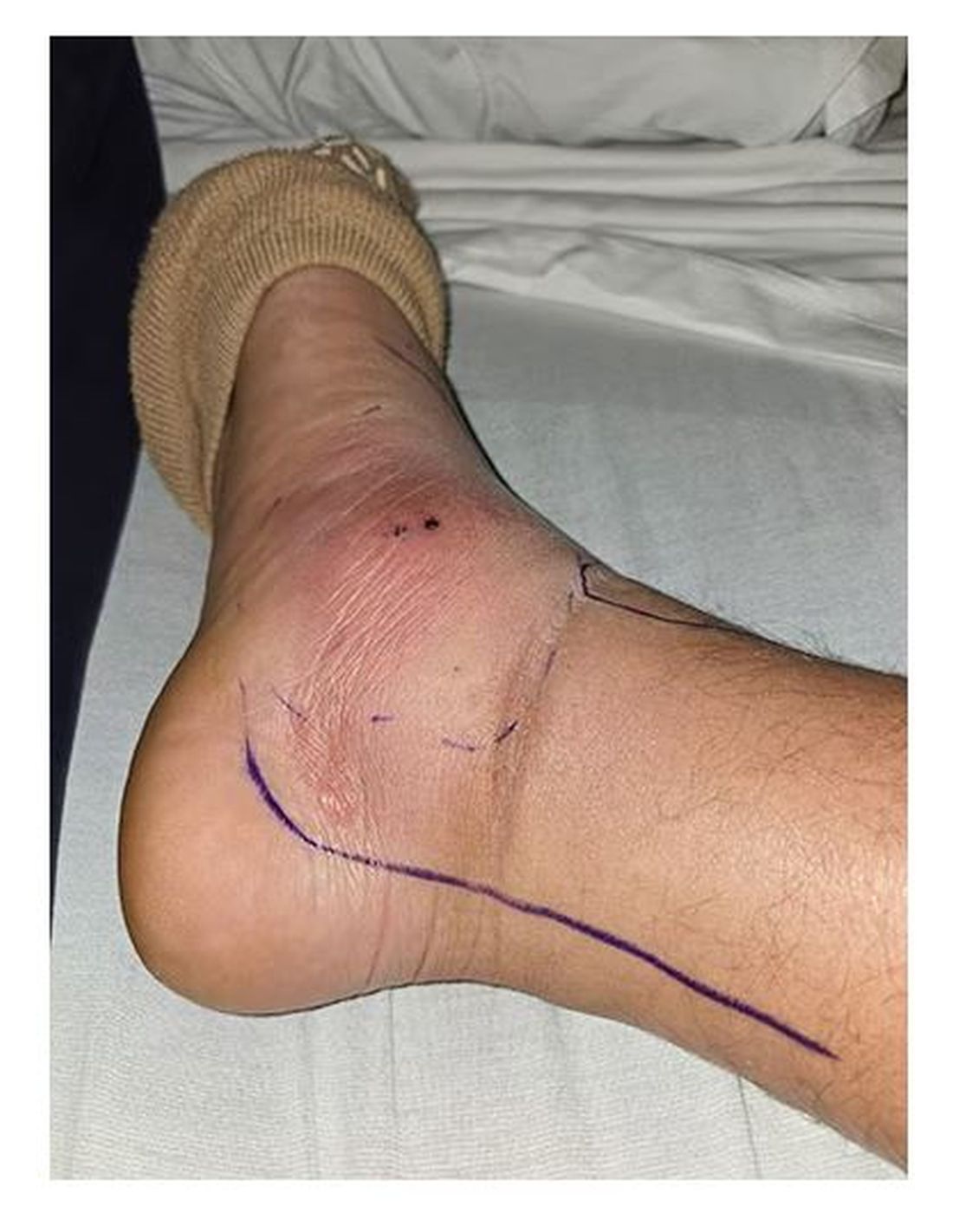
I’m going to talk about a study that links manliness (or, scientifically speaking, “male gender expressivity”) to medical diagnoses that are based on hard evidence and medical diagnoses that are based on self-report. You see where this is going but I want to walk you through the methods here because they are fairly interesting.
This study used data from the US National Longitudinal Study of Adolescent to Adult Health. This study enrolled 20,000 adolescents who were in grades 7-12 in the 1994-1995 school year and has been following them ever since — about 30 years so far.
The authors wanted to link early gender roles to long-term outcomes, so they cut that 20,000 number down to the 4230 males in the group who had complete follow-up.
Now comes the first interesting question. How do you quantify the “male gender expressivity” of boys in 7th-12th grade? There was no survey item that asked them how masculine or manly they felt. What the authors did was look at the surveys that were administered and identify the questions on those surveys where boys and girls gave the most disparate answers. I have some examples here. 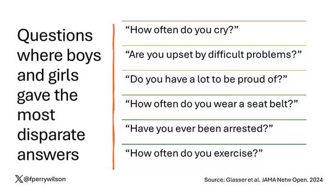
Some of these questions make sense when it comes to gender expressivity: “How often do you cry?” for example, has a lot of validity for the social construct that is gender. But some questions where boys and girls gave very different answers — like “How often do you exercise?” — don’t quite fit that mold. Regardless, this structure allowed the researchers to take individual kids’ responses to these questions and combine them into what amounts to a manliness score — how much their answers aligned with the typical male answer.
The score was established in adolescence — which is interesting because I’m sure some of this stuff may change over time — but notable because adolescence is where many gender roles develop.
Now we can fast-forward 30 years and see how these manliness scores link to various outcomes. The authors were interested in fairly common diseases: diabetes, hypertension, and hyperlipidemia.
Let’s start simply. Are males with higher gender expressivity in adolescence more or less likely to have these diseases in the future?
Not really. Those above the average in male gender expressivity had similar rates of hypertension and hyperlipidemia as those below the median. They were actually a bit less likely to have diabetes.
But that’s not what’s really interesting here.
I told you that there was no difference in the rate of hypertension among those with high vs low male gender expressivity. But there was a significant difference in their answer to the question “Do you have hypertension?” The same was seen for hyperlipidemia. In other words, those with higher manliness scores are less likely to admit (or perhaps know) that they have a particular disease.
You can see the relationship across the manliness spectrum here in a series of adjusted models. The x-axis is the male gender expressivity score, and the y-axis is the percentage of people who report having the disease that we know they have based on the actual laboratory tests or vital sign measurements. As manliness increases, the self-report of a given disease decreases.
There are some important consequences of this systematic denial. Specifically, men with the diseases of interest who have higher male gender expressivity are less likely to get treatment. And, as we all know, the lack of treatment of something like hypertension puts people at risk for bad downstream outcomes.
Putting this all together, I’m not that surprised. Society trains boys from a young age to behave in certain ways: to hide emotions, to eschew vulnerability, to not complain when we are hurt. And those lessons can persist into later life. Whether the disease that strikes is hypertension or Pasteurella multocida from a slightly psychotic house cat, men are more likely to ignore it, to their detriment. 
So, gents, be brave. Get your blood tests and check your blood pressure. If there’s something wrong, admit it, and fix it. After all, fixing problems — that’s a manly thing, right?
Dr. Wilson is associate professor of medicine and public health and director of the Clinical and Translational Research Accelerator at Yale University, New Haven, Conn. He has disclosed no relevant financial relationships.
A version of this article appeared on Medscape.com.
When my normally adorable cat Biscuit bit my ankle in a playful stalking exercise gone wrong, I washed it with soap and some rubbing alcohol, slapped on a Band-Aid, and went about my day.
The next morning, when it was swollen, I told myself it was probably just a hematoma and went about my day.
The next day, when the swelling had increased and red lines started creeping up my leg, I called my doctor. Long story short, I ended up hospitalized for intravenous antibiotics.
This is all to say that, yes, I’m sort of an idiot, but also to introduce the idea that maybe I minimized my very obvious lymphangitis because I am a man.
This week, we have empirical evidence that men downplay their medical symptoms — and that manlier men downplay them even more.
I’m going to talk about a study that links manliness (or, scientifically speaking, “male gender expressivity”) to medical diagnoses that are based on hard evidence and medical diagnoses that are based on self-report. You see where this is going but I want to walk you through the methods here because they are fairly interesting.
This study used data from the US National Longitudinal Study of Adolescent to Adult Health. This study enrolled 20,000 adolescents who were in grades 7-12 in the 1994-1995 school year and has been following them ever since — about 30 years so far.
The authors wanted to link early gender roles to long-term outcomes, so they cut that 20,000 number down to the 4230 males in the group who had complete follow-up.
Now comes the first interesting question. How do you quantify the “male gender expressivity” of boys in 7th-12th grade? There was no survey item that asked them how masculine or manly they felt. What the authors did was look at the surveys that were administered and identify the questions on those surveys where boys and girls gave the most disparate answers. I have some examples here.
Some of these questions make sense when it comes to gender expressivity: “How often do you cry?” for example, has a lot of validity for the social construct that is gender. But some questions where boys and girls gave very different answers — like “How often do you exercise?” — don’t quite fit that mold. Regardless, this structure allowed the researchers to take individual kids’ responses to these questions and combine them into what amounts to a manliness score — how much their answers aligned with the typical male answer.
The score was established in adolescence — which is interesting because I’m sure some of this stuff may change over time — but notable because adolescence is where many gender roles develop.
Now we can fast-forward 30 years and see how these manliness scores link to various outcomes. The authors were interested in fairly common diseases: diabetes, hypertension, and hyperlipidemia.
Let’s start simply. Are males with higher gender expressivity in adolescence more or less likely to have these diseases in the future?
Not really. Those above the average in male gender expressivity had similar rates of hypertension and hyperlipidemia as those below the median. They were actually a bit less likely to have diabetes.
But that’s not what’s really interesting here.
I told you that there was no difference in the rate of hypertension among those with high vs low male gender expressivity. But there was a significant difference in their answer to the question “Do you have hypertension?” The same was seen for hyperlipidemia. In other words, those with higher manliness scores are less likely to admit (or perhaps know) that they have a particular disease.
You can see the relationship across the manliness spectrum here in a series of adjusted models. The x-axis is the male gender expressivity score, and the y-axis is the percentage of people who report having the disease that we know they have based on the actual laboratory tests or vital sign measurements. As manliness increases, the self-report of a given disease decreases.
There are some important consequences of this systematic denial. Specifically, men with the diseases of interest who have higher male gender expressivity are less likely to get treatment. And, as we all know, the lack of treatment of something like hypertension puts people at risk for bad downstream outcomes.
Putting this all together, I’m not that surprised. Society trains boys from a young age to behave in certain ways: to hide emotions, to eschew vulnerability, to not complain when we are hurt. And those lessons can persist into later life. Whether the disease that strikes is hypertension or Pasteurella multocida from a slightly psychotic house cat, men are more likely to ignore it, to their detriment.
So, gents, be brave. Get your blood tests and check your blood pressure. If there’s something wrong, admit it, and fix it. After all, fixing problems — that’s a manly thing, right?
Dr. Wilson is associate professor of medicine and public health and director of the Clinical and Translational Research Accelerator at Yale University, New Haven, Conn. He has disclosed no relevant financial relationships.
A version of this article appeared on Medscape.com.

Why Cardiac Biomarkers Don’t Help Predict Heart Disease
This transcript has been edited for clarity.
It’s the counterintuitive stuff in epidemiology that always really interests me. One intuition many of us have is that if a risk factor is significantly associated with an outcome, knowledge of that risk factor would help to predict that outcome. Makes sense. Feels right.
But it’s not right. Not always.
Here’s a fake example to illustrate my point. Let’s say we have 10,000 individuals who we follow for 10 years and 2000 of them die. (It’s been a rough decade.) At baseline, I measured a novel biomarker, the Perry Factor, in everyone. To keep it simple, the Perry Factor has only two values: 0 or 1.
I then do a standard associational analysis and find that individuals who are positive for the Perry Factor have a 40-fold higher odds of death than those who are negative for it. I am beginning to reconsider ascribing my good name to this biomarker. This is a highly statistically significant result — a P value <.001.
Clearly, knowledge of the Perry Factor should help me predict who will die in the cohort. I evaluate predictive power using a metric called the area under the receiver operating characteristic curve (AUC, referred to as the C-statistic in time-to-event studies). It tells you, given two people — one who dies and one who doesn’t — how frequently you “pick” the right person, given the knowledge of their Perry Factor.
A C-statistic of 0.5, or 50%, would mean the Perry Factor gives you no better results than a coin flip; it’s chance. A C-statistic of 1 is perfect prediction. So, what will the C-statistic be, given the incredibly strong association of the Perry Factor with outcomes? 0.9? 0.95?
0.5024. Almost useless.

Let’s figure out why strength of association and usefulness for prediction are not always the same thing.
I constructed my fake Perry Factor dataset quite carefully to illustrate this point. Let me show you what happened. What you see here is a breakdown of the patients in my fake study. You can see that just 11 of them were Perry Factor positive, but 10 of those 11 ended up dying.
That’s quite unlikely by chance alone. It really does appear that if you have Perry Factor, your risk for death is much higher. But the reason that Perry Factor is a bad predictor is because it is so rare in the population. Sure, you can use it to correctly predict the outcome of 10 of the 11 people who have it, but the vast majority of people don’t have Perry Factor. It’s useless to distinguish who will die vs who will live in that population.
Why have I spent so much time trying to reverse our intuition that strength of association and strength of predictive power must be related? Because it helps to explain this paper, “Prognostic Value of Cardiovascular Biomarkers in the Population,” appearing in JAMA, which is a very nice piece of work trying to help us better predict cardiovascular disease.
I don’t need to tell you that cardiovascular disease is the number-one killer in this country and most of the world. I don’t need to tell you that we have really good preventive therapies and lifestyle interventions that can reduce the risk. But it would be nice to know in whom, specifically, we should use those interventions.
Cardiovascular risk scores, to date, are pretty simple. The most common one in use in the United States, the pooled cohort risk equation, has nine variables, two of which require a cholesterol panel and one a blood pressure test. It’s easy and it’s pretty accurate.
Using the score from the pooled cohort risk calculator, you get a C-statistic as high as 0.82 when applied to Black women, a low of 0.71 when applied to Black men. Non-Black individuals are in the middle. Not bad. But, clearly, not perfect.
And aren’t we in the era of big data, the era of personalized medicine? We have dozens, maybe hundreds, of quantifiable biomarkers that are associated with subsequent heart disease. Surely, by adding these biomarkers into the risk equation, we can improve prediction. Right?
The JAMA study includes 164,054 patients pooled from 28 cohort studies from 12 countries. All the studies measured various key biomarkers at baseline and followed their participants for cardiovascular events like heart attack, stroke, coronary revascularization, and so on.
The biomarkers in question are really the big guns in this space: troponin, a marker of stress on the heart muscle; NT-proBNP, a marker of stretch on the heart muscle; and C-reactive protein, a marker of inflammation. In every case, higher levels of these markers at baseline were associated with a higher risk for cardiovascular disease in the future.
Troponin T, shown here, has a basically linear risk with subsequent cardiovascular disease.
BNP seems to demonstrate more of a threshold effect, where levels above 60 start to associate with problems.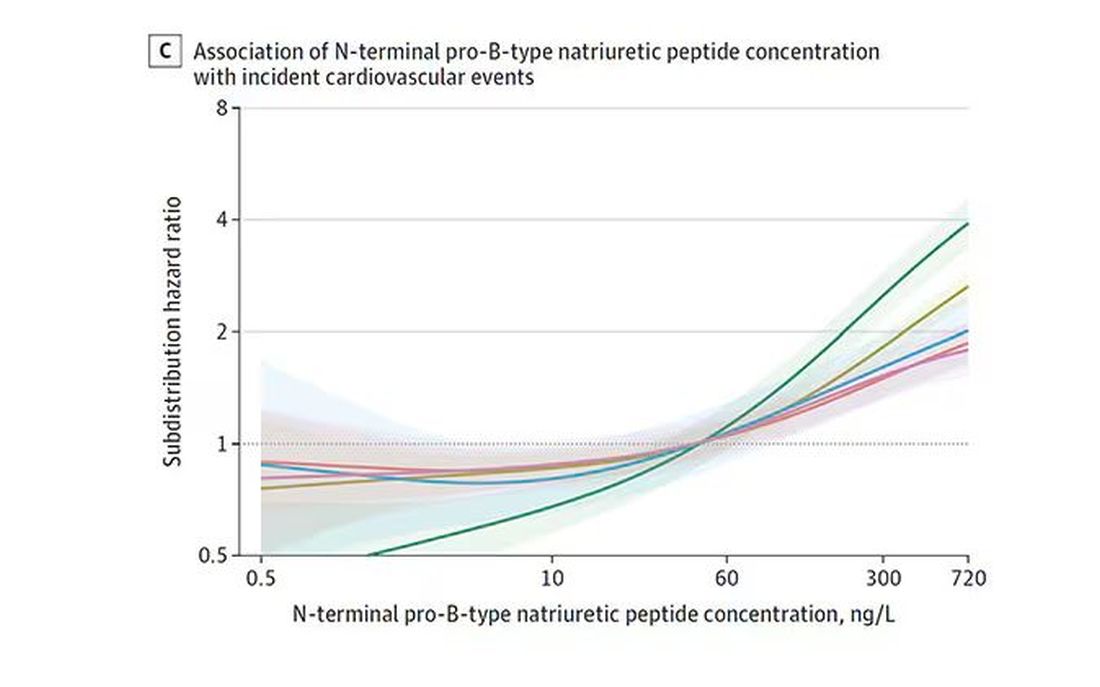
And CRP does a similar thing, with levels above 1.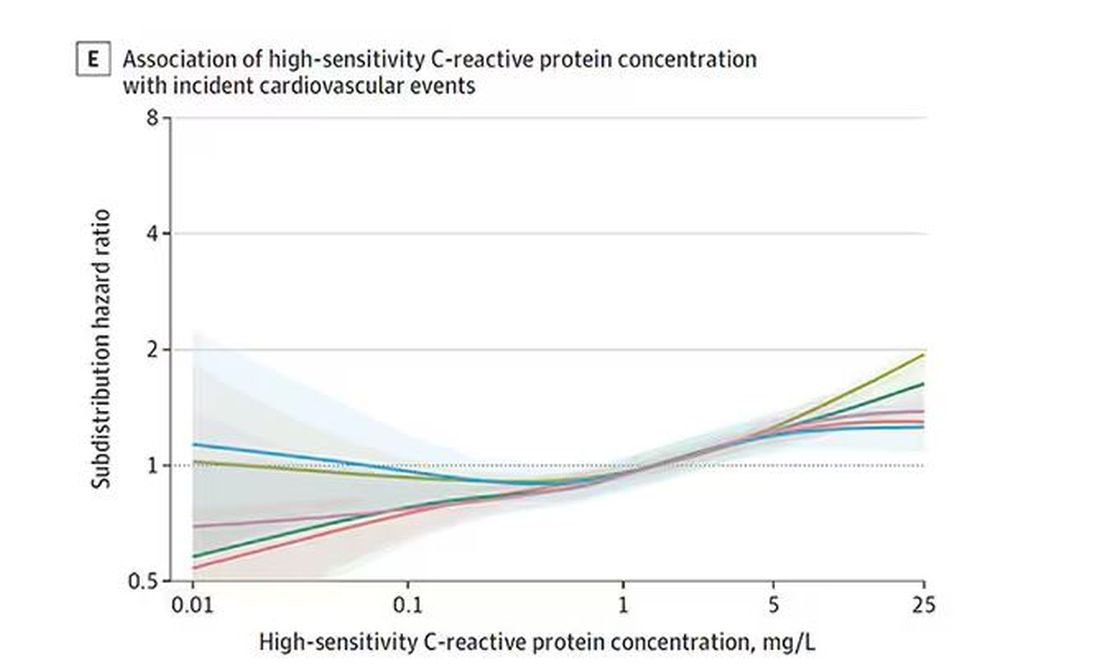
All of these findings were statistically significant. If you have higher levels of one or more of these biomarkers, you are more likely to have cardiovascular disease in the future.
Of course, our old friend the pooled cohort risk equation is still here — in the background — requiring just that one blood test and measurement of blood pressure. Let’s talk about predictive power.
The pooled cohort risk equation score, in this study, had a C-statistic of 0.812.
By adding troponin, BNP, and CRP to the equation, the new C-statistic is 0.819. Barely any change.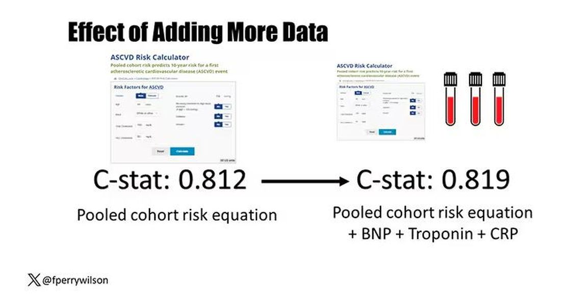
Now, the authors looked at different types of prediction here. The greatest improvement in the AUC was seen when they tried to predict heart failure within 1 year of measurement; there the AUC improved by 0.04. But the presence of BNP as a biomarker and the short time window of 1 year makes me wonder whether this is really prediction at all or whether they were essentially just diagnosing people with existing heart failure.
Why does this happen? Why do these promising biomarkers, clearly associated with bad outcomes, fail to improve our ability to predict the future? I already gave one example, which has to do with how the markers are distributed in the population. But even more relevant here is that the new markers will only improve prediction insofar as they are not already represented in the old predictive model.
Of course, BNP, for example, wasn’t in the old model. But smoking was. Diabetes was. Blood pressure was. All of that data might actually tell you something about the patient’s BNP through their mutual correlation. And improvement in prediction requires new information.
This is actually why I consider this a really successful study. We need to do studies like this to help us find what those new sources of information might be.
We will never get to a C-statistic of 1. Perfect prediction is the domain of palm readers and astrophysicists. But better prediction is always possible through data. The big question, of course, is which data?
Dr. Wilson is associate professor of medicine and public health and director of the Clinical and Translational Research Accelerator at Yale University, New Haven, Conn. He has disclosed no relevant financial relationships.
A version of this article appeared on Medscape.com.
This transcript has been edited for clarity.
It’s the counterintuitive stuff in epidemiology that always really interests me. One intuition many of us have is that if a risk factor is significantly associated with an outcome, knowledge of that risk factor would help to predict that outcome. Makes sense. Feels right.
But it’s not right. Not always.
Here’s a fake example to illustrate my point. Let’s say we have 10,000 individuals who we follow for 10 years and 2000 of them die. (It’s been a rough decade.) At baseline, I measured a novel biomarker, the Perry Factor, in everyone. To keep it simple, the Perry Factor has only two values: 0 or 1.
I then do a standard associational analysis and find that individuals who are positive for the Perry Factor have a 40-fold higher odds of death than those who are negative for it. I am beginning to reconsider ascribing my good name to this biomarker. This is a highly statistically significant result — a P value <.001.
Clearly, knowledge of the Perry Factor should help me predict who will die in the cohort. I evaluate predictive power using a metric called the area under the receiver operating characteristic curve (AUC, referred to as the C-statistic in time-to-event studies). It tells you, given two people — one who dies and one who doesn’t — how frequently you “pick” the right person, given the knowledge of their Perry Factor.
A C-statistic of 0.5, or 50%, would mean the Perry Factor gives you no better results than a coin flip; it’s chance. A C-statistic of 1 is perfect prediction. So, what will the C-statistic be, given the incredibly strong association of the Perry Factor with outcomes? 0.9? 0.95?
0.5024. Almost useless.
Let’s figure out why strength of association and usefulness for prediction are not always the same thing.
I constructed my fake Perry Factor dataset quite carefully to illustrate this point. Let me show you what happened. What you see here is a breakdown of the patients in my fake study. You can see that just 11 of them were Perry Factor positive, but 10 of those 11 ended up dying.
That’s quite unlikely by chance alone. It really does appear that if you have Perry Factor, your risk for death is much higher. But the reason that Perry Factor is a bad predictor is because it is so rare in the population. Sure, you can use it to correctly predict the outcome of 10 of the 11 people who have it, but the vast majority of people don’t have Perry Factor. It’s useless to distinguish who will die vs who will live in that population.
Why have I spent so much time trying to reverse our intuition that strength of association and strength of predictive power must be related? Because it helps to explain this paper, “Prognostic Value of Cardiovascular Biomarkers in the Population,” appearing in JAMA, which is a very nice piece of work trying to help us better predict cardiovascular disease.
I don’t need to tell you that cardiovascular disease is the number-one killer in this country and most of the world. I don’t need to tell you that we have really good preventive therapies and lifestyle interventions that can reduce the risk. But it would be nice to know in whom, specifically, we should use those interventions.
Cardiovascular risk scores, to date, are pretty simple. The most common one in use in the United States, the pooled cohort risk equation, has nine variables, two of which require a cholesterol panel and one a blood pressure test. It’s easy and it’s pretty accurate.
Using the score from the pooled cohort risk calculator, you get a C-statistic as high as 0.82 when applied to Black women, a low of 0.71 when applied to Black men. Non-Black individuals are in the middle. Not bad. But, clearly, not perfect.
And aren’t we in the era of big data, the era of personalized medicine? We have dozens, maybe hundreds, of quantifiable biomarkers that are associated with subsequent heart disease. Surely, by adding these biomarkers into the risk equation, we can improve prediction. Right?
The JAMA study includes 164,054 patients pooled from 28 cohort studies from 12 countries. All the studies measured various key biomarkers at baseline and followed their participants for cardiovascular events like heart attack, stroke, coronary revascularization, and so on.
The biomarkers in question are really the big guns in this space: troponin, a marker of stress on the heart muscle; NT-proBNP, a marker of stretch on the heart muscle; and C-reactive protein, a marker of inflammation. In every case, higher levels of these markers at baseline were associated with a higher risk for cardiovascular disease in the future.
Troponin T, shown here, has a basically linear risk with subsequent cardiovascular disease.
BNP seems to demonstrate more of a threshold effect, where levels above 60 start to associate with problems.
And CRP does a similar thing, with levels above 1.
All of these findings were statistically significant. If you have higher levels of one or more of these biomarkers, you are more likely to have cardiovascular disease in the future.
Of course, our old friend the pooled cohort risk equation is still here — in the background — requiring just that one blood test and measurement of blood pressure. Let’s talk about predictive power.
The pooled cohort risk equation score, in this study, had a C-statistic of 0.812.
By adding troponin, BNP, and CRP to the equation, the new C-statistic is 0.819. Barely any change.
Now, the authors looked at different types of prediction here. The greatest improvement in the AUC was seen when they tried to predict heart failure within 1 year of measurement; there the AUC improved by 0.04. But the presence of BNP as a biomarker and the short time window of 1 year makes me wonder whether this is really prediction at all or whether they were essentially just diagnosing people with existing heart failure.
Why does this happen? Why do these promising biomarkers, clearly associated with bad outcomes, fail to improve our ability to predict the future? I already gave one example, which has to do with how the markers are distributed in the population. But even more relevant here is that the new markers will only improve prediction insofar as they are not already represented in the old predictive model.
Of course, BNP, for example, wasn’t in the old model. But smoking was. Diabetes was. Blood pressure was. All of that data might actually tell you something about the patient’s BNP through their mutual correlation. And improvement in prediction requires new information.
This is actually why I consider this a really successful study. We need to do studies like this to help us find what those new sources of information might be.
We will never get to a C-statistic of 1. Perfect prediction is the domain of palm readers and astrophysicists. But better prediction is always possible through data. The big question, of course, is which data?
Dr. Wilson is associate professor of medicine and public health and director of the Clinical and Translational Research Accelerator at Yale University, New Haven, Conn. He has disclosed no relevant financial relationships.
A version of this article appeared on Medscape.com.
It Would Be Nice if Olive Oil Really Did Prevent Dementia
This transcript has been edited for clarity.
As you all know by now, I’m always looking out for lifestyle changes that are both pleasurable and healthy. They are hard to find, especially when it comes to diet. My kids complain about this all the time: “When you say ‘healthy food,’ you just mean yucky food.” And yes, French fries are amazing, and no, we can’t have them three times a day.
So, when I saw an article claiming that olive oil reduces the risk for dementia, I was interested. I love olive oil; I cook with it all the time. But as is always the case in the world of nutritional epidemiology, we need to be careful. There are a lot of reasons to doubt the results of this study — and one reason to believe it’s true.
The study I’m talking about is “Consumption of Olive Oil and Diet Quality and Risk of Dementia-Related Death,” appearing in JAMA Network Open and following a well-trod formula in the nutritional epidemiology space.
Nearly 100,000 participants, all healthcare workers, filled out a food frequency questionnaire every 4 years with 130 questions touching on all aspects of diet: How often do you eat bananas, bacon, olive oil? Participants were followed for more than 20 years, and if they died, the cause of death was flagged as being dementia-related or not. Over that time frame there were around 38,000 deaths, of which 4751 were due to dementia.
The rest is just statistics. The authors show that those who reported consuming more olive oil were less likely to die from dementia — about 50% less likely, if you compare those who reported eating more than 7 grams of olive oil a day with those who reported eating none.
Is It What You Eat, or What You Don’t Eat?
And we could stop there if we wanted to; I’m sure big olive oil would be happy with that. Is there such a thing as “big olive oil”? But no, we need to dig deeper here because this study has the same problems as all nutritional epidemiology studies. Number one, no one is sitting around drinking small cups of olive oil. They consume it with other foods. And it was clear from the food frequency questionnaire that people who consumed more olive oil also consumed less red meat, more fruits and vegetables, more whole grains, more butter, and less margarine. And those are just the findings reported in the paper. I suspect that people who eat more olive oil also eat more tomatoes, for example, though data this granular aren’t shown. So, it can be really hard, in studies like this, to know for sure that it’s actually the olive oil that is helpful rather than some other constituent in the diet.
The flip side of that coin presents another issue. The food you eat is also a marker of the food you don’t eat. People who ate olive oil consumed less margarine, for example. At the time of this study, margarine was still adulterated with trans-fats, which a pretty solid evidence base suggests are really bad for your vascular system. So perhaps it’s not that olive oil is particularly good for you but that something else is bad for you. In other words, simply adding olive oil to your diet without changing anything else may not do anything.
The other major problem with studies of this sort is that people don’t consume food at random. The type of person who eats a lot of olive oil is simply different from the type of person who doesn›t. For one thing, olive oil is expensive. A 25-ounce bottle of olive oil is on sale at my local supermarket right now for $11.00. A similar-sized bottle of vegetable oil goes for $4.00.
Isn’t it interesting that food that costs more money tends to be associated with better health outcomes? (I’m looking at you, red wine.) Perhaps it’s not the food; perhaps it’s the money. We aren’t provided data on household income in this study, but we can see that the heavy olive oil users were less likely to be current smokers and they got more physical activity.
Now, the authors are aware of these limitations and do their best to account for them. In multivariable models, they adjust for other stuff in the diet, and even for income (sort of; they use census tract as a proxy for income, which is really a broad brush), and still find a significant though weakened association showing a protective effect of olive oil on dementia-related death. But still — adjustment is never perfect, and the small effect size here could definitely be due to residual confounding.
Evidence More Convincing
Now, I did tell you that there is one reason to believe that this study is true, but it’s not really from this study.
It’s from the PREDIMED randomized trial.
This is nutritional epidemiology I can get behind. Published in 2018, investigators in Spain randomized around 7500 participants to receive a liter of olive oil once a week vs mixed nuts, vs small nonfood gifts, the idea here being that if you have olive oil around, you’ll use it more. And people who were randomly assigned to get the olive oil had a 30% lower rate of cardiovascular events. A secondary analysis of that study found that the rate of development of mild cognitive impairment was 65% lower in those who were randomly assigned to olive oil. That’s an impressive result.
So, there might be something to this olive oil thing, but I’m not quite ready to add it to my “pleasurable things that are still good for you” list just yet. Though it does make me wonder: Can we make French fries in the stuff?
Dr. Wilson is associate professor of medicine and public health and director of the Clinical and Translational Research Accelerator at Yale University, New Haven, Conn. He has disclosed no relevant financial relationships.
A version of this article appeared on Medscape.com.
Intermittent Fasting + HIIT: Fitness Fad or Fix?
Let’s be honest: Although as physicians we have the power of the prescription pad, so much of health, in the end, comes down to lifestyle. Of course, taking a pill is often way easier than changing your longstanding habits. And what’s worse, doesn’t it always seem like the lifestyle stuff that is good for your health is unpleasant?
Two recent lifestyle interventions that I have tried and find really not enjoyable are time-restricted eating (also known as intermittent fasting) and high-intensity interval training, or HIIT. The former leaves me hangry for half the day; the latter is, well, it’s just really hard compared with my usual jog.

But given the rule of unpleasant lifestyle changes, I knew as soon as I saw this recent study what the result would be. What if we combined time-restricted eating with high-intensity interval training?
I’m referring to this study, appearing in PLOS ONE from Ranya Ameur and colleagues, which is a small trial that enrolled otherwise healthy women with a BMI > 30 and randomized them to one of three conditions.
First was time-restricted eating. Women in this group could eat whatever they wanted, but only from 8 a.m. to 4 p.m. daily.
Second: high-intensity functional training. This is a variant of high-intensity interval training which focuses a bit more on resistance exercise than on pure cardiovascular stuff but has the same vibe of doing brief bursts of intensive activity followed by a cool-down period.
Third: a combination of the two. Sounds rough to me.
The study was otherwise straightforward. At baseline, researchers collected data on body composition and dietary intake, and measured blood pressure, glucose, insulin, and lipid biomarkers. A 12-week intervention period followed, after which all of this stuff was measured again.
Now, you may have noticed that there is no control group in this study. We’ll come back to that — a few times.
Let me walk you through some of the outcomes here.
First off, body composition metrics. All three groups lost weight — on average, around 10% of body weight which, for a 12-week intervention, is fairly impressive. BMI and waist circumference went down as well, and, interestingly, much of the weight loss here was in fat mass, not fat-free mass.
Most interventions that lead to weight loss — and I’m including some of the newer drugs here — lead to both fat and muscle loss. That might not be as bad as it sounds; the truth is that muscle mass increases as fat increases because of the simple fact that if you’re carrying more weight when you walk around, your leg muscles get bigger. But to preserve muscle mass in the face of fat loss is sort of a Goldilocks finding, and, based on these results, there’s a suggestion that the high-intensity functional training helps to do just that.
The dietary intake findings were really surprising to me. Across the board, caloric intake decreased. It’s no surprise that time-restricted eating reduces calorie intake. That has been shown many times before and is probably the main reason it induces weight loss — less time to eat means you eat less.
But why would high-intensity functional training lead to lower caloric intake? Most people, myself included, get hungry after they exercise. In fact, one of the reasons it’s hard to lose weight with exercise alone is that we end up eating more calories to make up for what we lost during the exercise. This calorie reduction could be a unique effect of this type of exercise, but honestly this could also be something called the Hawthorne effect. Women in the study kept a food diary to track their intake, and the act of doing that might actually make you eat less. It makes it a little more annoying to snack a bit if you know you have to write it down. This is a situation where I would kill for a control group.
The lipid findings are also pretty striking, with around a 40% reduction in LDL across the board, and evidence of synergistic effects of combined TRE and high-intensity training on total cholesterol and triglycerides. This is like a statin level of effect — pretty impressive. Again, my heart pines for a control group, though.
Same story with glucose and insulin measures: an impressive reduction in fasting glucose and good evidence that the combination of time-restricted eating and high-intensity functional training reduces insulin levels and HOMA-IR as well.
Really the only thing that wasn’t very impressive was the change in blood pressure, with only modest decreases across the board.
Okay, so let’s take a breath after this high-intensity cerebral workout and put this all together. This was a small study, lacking a control group, but with large effect sizes in very relevant clinical areas. It confirms what we know about time-restricted eating — that it makes you eat less calories — and introduces the potential that vigorous exercise can not only magnify the benefits of time-restricted eating but maybe even mitigate some of the risks, like the risk for muscle loss. And of course, it comports with my central hypothesis, which is that the more unpleasant a lifestyle intervention is, the better it is for you. No pain, no gain, right?
Of course, I am being overly dogmatic. There are plenty of caveats. Wrestling bears is quite unpleasant and almost certainly bad for you. And there are even some pleasant things that are pretty good for you — like coffee and sex. And there are even people who find time-restricted eating and high-intensity training pleasurable. They are called masochists.
I’m joking. The truth is that Or, at least, much less painful. The trick is getting over the hump of change. If only there were a pill for that.
Dr. Wilson is associate professor of medicine and public health and director of the Clinical and Translational Research Accelerator at Yale University, New Haven, Connecticut. He has disclosed no relevant financial relationships. This transcript has been edited for clarity.
A version of this article appeared on Medscape.com.
Let’s be honest: Although as physicians we have the power of the prescription pad, so much of health, in the end, comes down to lifestyle. Of course, taking a pill is often way easier than changing your longstanding habits. And what’s worse, doesn’t it always seem like the lifestyle stuff that is good for your health is unpleasant?
Two recent lifestyle interventions that I have tried and find really not enjoyable are time-restricted eating (also known as intermittent fasting) and high-intensity interval training, or HIIT. The former leaves me hangry for half the day; the latter is, well, it’s just really hard compared with my usual jog.
But given the rule of unpleasant lifestyle changes, I knew as soon as I saw this recent study what the result would be. What if we combined time-restricted eating with high-intensity interval training?
I’m referring to this study, appearing in PLOS ONE from Ranya Ameur and colleagues, which is a small trial that enrolled otherwise healthy women with a BMI > 30 and randomized them to one of three conditions.
First was time-restricted eating. Women in this group could eat whatever they wanted, but only from 8 a.m. to 4 p.m. daily.
Second: high-intensity functional training. This is a variant of high-intensity interval training which focuses a bit more on resistance exercise than on pure cardiovascular stuff but has the same vibe of doing brief bursts of intensive activity followed by a cool-down period.
Third: a combination of the two. Sounds rough to me.
The study was otherwise straightforward. At baseline, researchers collected data on body composition and dietary intake, and measured blood pressure, glucose, insulin, and lipid biomarkers. A 12-week intervention period followed, after which all of this stuff was measured again.
Now, you may have noticed that there is no control group in this study. We’ll come back to that — a few times.
Let me walk you through some of the outcomes here.
First off, body composition metrics. All three groups lost weight — on average, around 10% of body weight which, for a 12-week intervention, is fairly impressive. BMI and waist circumference went down as well, and, interestingly, much of the weight loss here was in fat mass, not fat-free mass.
Most interventions that lead to weight loss — and I’m including some of the newer drugs here — lead to both fat and muscle loss. That might not be as bad as it sounds; the truth is that muscle mass increases as fat increases because of the simple fact that if you’re carrying more weight when you walk around, your leg muscles get bigger. But to preserve muscle mass in the face of fat loss is sort of a Goldilocks finding, and, based on these results, there’s a suggestion that the high-intensity functional training helps to do just that.
The dietary intake findings were really surprising to me. Across the board, caloric intake decreased. It’s no surprise that time-restricted eating reduces calorie intake. That has been shown many times before and is probably the main reason it induces weight loss — less time to eat means you eat less.
But why would high-intensity functional training lead to lower caloric intake? Most people, myself included, get hungry after they exercise. In fact, one of the reasons it’s hard to lose weight with exercise alone is that we end up eating more calories to make up for what we lost during the exercise. This calorie reduction could be a unique effect of this type of exercise, but honestly this could also be something called the Hawthorne effect. Women in the study kept a food diary to track their intake, and the act of doing that might actually make you eat less. It makes it a little more annoying to snack a bit if you know you have to write it down. This is a situation where I would kill for a control group.
The lipid findings are also pretty striking, with around a 40% reduction in LDL across the board, and evidence of synergistic effects of combined TRE and high-intensity training on total cholesterol and triglycerides. This is like a statin level of effect — pretty impressive. Again, my heart pines for a control group, though.
Same story with glucose and insulin measures: an impressive reduction in fasting glucose and good evidence that the combination of time-restricted eating and high-intensity functional training reduces insulin levels and HOMA-IR as well.
Really the only thing that wasn’t very impressive was the change in blood pressure, with only modest decreases across the board.
Okay, so let’s take a breath after this high-intensity cerebral workout and put this all together. This was a small study, lacking a control group, but with large effect sizes in very relevant clinical areas. It confirms what we know about time-restricted eating — that it makes you eat less calories — and introduces the potential that vigorous exercise can not only magnify the benefits of time-restricted eating but maybe even mitigate some of the risks, like the risk for muscle loss. And of course, it comports with my central hypothesis, which is that the more unpleasant a lifestyle intervention is, the better it is for you. No pain, no gain, right?
Of course, I am being overly dogmatic. There are plenty of caveats. Wrestling bears is quite unpleasant and almost certainly bad for you. And there are even some pleasant things that are pretty good for you — like coffee and sex. And there are even people who find time-restricted eating and high-intensity training pleasurable. They are called masochists.
I’m joking. The truth is that Or, at least, much less painful. The trick is getting over the hump of change. If only there were a pill for that.
Dr. Wilson is associate professor of medicine and public health and director of the Clinical and Translational Research Accelerator at Yale University, New Haven, Connecticut. He has disclosed no relevant financial relationships. This transcript has been edited for clarity.
A version of this article appeared on Medscape.com.
Are Women Better Doctors Than Men?
This transcript has been edited for clarity.
It’s a battle of the sexes today as we dive into a paper that makes you say, “Wow, what an interesting study” and also “Boy, am I glad I didn’t do that study.” That’s because studies like this are always somewhat fraught; they say something about medicine but also something about society — and that makes this a bit precarious. But that’s never stopped us before. So, let’s go ahead and try to answer the question: Do women make better doctors than men?
On the surface, this question seems nearly impossible to answer. It’s too broad; what does it mean to be a “better” doctor? At first blush it seems that there are just too many variables to control for here: the type of doctor, the type of patient, the clinical scenario, and so on.
But this study, “Comparison of hospital mortality and readmission rates by physician and patient sex,” which appears in Annals of Internal Medicine, uses a fairly ingenious method to cut through all the bias by leveraging two simple facts: First, hospital medicine is largely conducted by hospitalists these days; second, due to the shift-based nature of hospitalist work, the hospitalist you get when you are admitted to the hospital is pretty much random.
In other words, if you are admitted to the hospital for an acute illness and get a hospitalist as your attending, you have no control over whether it is a man or a woman. Is this a randomized trial? No, but it’s not bad.
Researchers used Medicare claims data to identify adults over age 65 who had nonelective hospital admissions throughout the United States. The claims revealed the sex of the patient and the name of the attending physician. By linking to a medical provider database, they could determine the sex of the provider.
The goal was to look at outcomes across four dyads:
- Male patient – male doctor
- Male patient – female doctor
- Female patient – male doctor
- Female patient – female doctor
The primary outcome was 30-day mortality.
I told you that focusing on hospitalists produces some pseudorandomization, but let’s look at the data to be sure. Just under a million patients were treated by approximately 50,000 physicians, 30% of whom were female. And, though female patients and male patients differed, they did not differ with respect to the sex of their hospitalist. So, by physician sex, patients were similar in mean age, race, ethnicity, household income, eligibility for Medicaid, and comorbid conditions. The authors even created a “predicted mortality” score which was similar across the groups as well.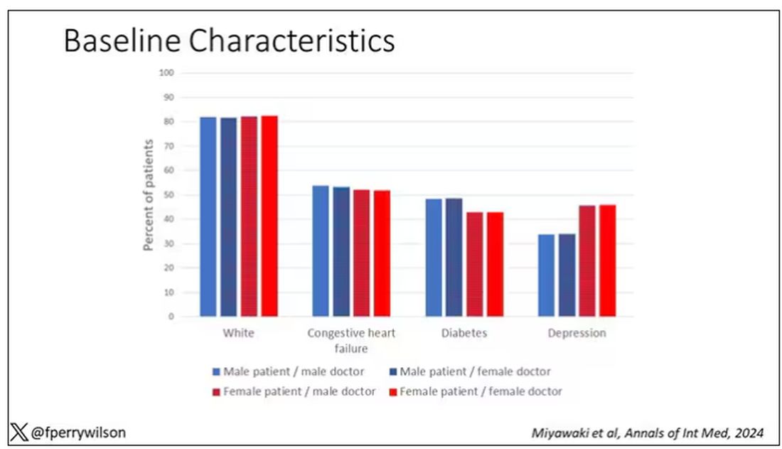
Now, the female physicians were a bit different from the male physicians. The female hospitalists were slightly more likely to have an osteopathic degree, had slightly fewer admissions per year, and were a bit younger.
So, we have broadly similar patients regardless of who their hospitalist was, but hospitalists differ by factors other than their sex. Fine.
I’ve graphed the results here. 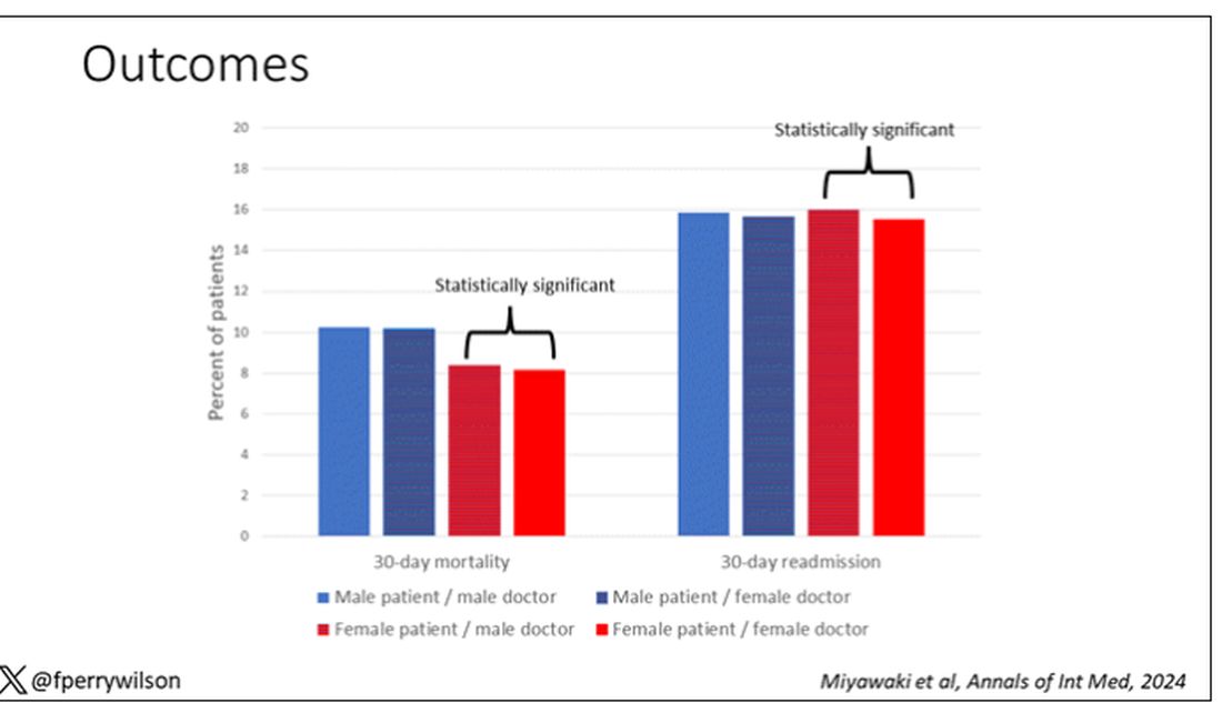
This is a relatively small effect, to be sure, but if you multiply it across the millions of hospitalist admissions per year, you can start to put up some real numbers.
So, what is going on here? I see four broad buckets of possibilities.
Let’s start with the obvious explanation: Women, on average, are better doctors than men. I am married to a woman doctor, and based on my personal experience, this explanation is undoubtedly true. But why would that be?
The authors cite data that suggest that female physicians are less likely than male physicians to dismiss patient concerns — and in particular, the concerns of female patients — perhaps leading to fewer missed diagnoses. But this is impossible to measure with administrative data, so this study can no more tell us whether these female hospitalists are more attentive than their male counterparts than it can suggest that the benefit is mediated by the shorter average height of female physicians. Perhaps the key is being closer to the patient?
The second possibility here is that this has nothing to do with the sex of the physician at all; it has to do with those other things that associate with the sex of the physician. We know, for example, that the female physicians saw fewer patients per year than the male physicians, but the study authors adjusted for this in the statistical models. Still, other unmeasured factors (confounders) could be present. By the way, confounders wouldn’t necessarily change the primary finding — you are better off being cared for by female physicians. It’s just not because they are female; it’s a convenient marker for some other quality, such as age.
The third possibility is that the study represents a phenomenon called collider bias. The idea here is that physicians only get into the study if they are hospitalists, and the quality of physicians who choose to become a hospitalist may differ by sex. When deciding on a specialty, a talented resident considering certain lifestyle issues may find hospital medicine particularly attractive — and that draw toward a more lifestyle-friendly specialty may differ by sex, as some prior studies have shown. If true, the pool of women hospitalists may be better than their male counterparts because male physicians of that caliber don’t become hospitalists.
Okay, don’t write in. I’m just trying to cite examples of how to think about collider bias. I can’t prove that this is the case, and in fact the authors do a sensitivity analysis of all physicians, not just hospitalists, and show the same thing. So this is probably not true, but epidemiology is fun, right?
And the fourth possibility: This is nothing but statistical noise. The effect size is incredibly small and just on the border of statistical significance. Especially when you’re working with very large datasets like this, you’ve got to be really careful about overinterpreting statistically significant findings that are nevertheless of small magnitude.
Regardless, it’s an interesting study, one that made me think and, of course, worry a bit about how I would present it. Forgive me if I’ve been indelicate in handling the complex issues of sex, gender, and society here. But I’m not sure what you expect; after all, I’m only a male doctor.
Dr. Wilson is associate professor of medicine and public health and director of the Clinical and Translational Research Accelerator at Yale University, New Haven, Conn. He has disclosed no relevant financial relationships.
A version of this article appeared on Medscape.com.
This transcript has been edited for clarity.
It’s a battle of the sexes today as we dive into a paper that makes you say, “Wow, what an interesting study” and also “Boy, am I glad I didn’t do that study.” That’s because studies like this are always somewhat fraught; they say something about medicine but also something about society — and that makes this a bit precarious. But that’s never stopped us before. So, let’s go ahead and try to answer the question: Do women make better doctors than men?
On the surface, this question seems nearly impossible to answer. It’s too broad; what does it mean to be a “better” doctor? At first blush it seems that there are just too many variables to control for here: the type of doctor, the type of patient, the clinical scenario, and so on.
But this study, “Comparison of hospital mortality and readmission rates by physician and patient sex,” which appears in Annals of Internal Medicine, uses a fairly ingenious method to cut through all the bias by leveraging two simple facts: First, hospital medicine is largely conducted by hospitalists these days; second, due to the shift-based nature of hospitalist work, the hospitalist you get when you are admitted to the hospital is pretty much random.
In other words, if you are admitted to the hospital for an acute illness and get a hospitalist as your attending, you have no control over whether it is a man or a woman. Is this a randomized trial? No, but it’s not bad.
Researchers used Medicare claims data to identify adults over age 65 who had nonelective hospital admissions throughout the United States. The claims revealed the sex of the patient and the name of the attending physician. By linking to a medical provider database, they could determine the sex of the provider.
The goal was to look at outcomes across four dyads:
- Male patient – male doctor
- Male patient – female doctor
- Female patient – male doctor
- Female patient – female doctor
The primary outcome was 30-day mortality.
I told you that focusing on hospitalists produces some pseudorandomization, but let’s look at the data to be sure. Just under a million patients were treated by approximately 50,000 physicians, 30% of whom were female. And, though female patients and male patients differed, they did not differ with respect to the sex of their hospitalist. So, by physician sex, patients were similar in mean age, race, ethnicity, household income, eligibility for Medicaid, and comorbid conditions. The authors even created a “predicted mortality” score which was similar across the groups as well.
Now, the female physicians were a bit different from the male physicians. The female hospitalists were slightly more likely to have an osteopathic degree, had slightly fewer admissions per year, and were a bit younger.
So, we have broadly similar patients regardless of who their hospitalist was, but hospitalists differ by factors other than their sex. Fine.
I’ve graphed the results here.
This is a relatively small effect, to be sure, but if you multiply it across the millions of hospitalist admissions per year, you can start to put up some real numbers.
So, what is going on here? I see four broad buckets of possibilities.
Let’s start with the obvious explanation: Women, on average, are better doctors than men. I am married to a woman doctor, and based on my personal experience, this explanation is undoubtedly true. But why would that be?
The authors cite data that suggest that female physicians are less likely than male physicians to dismiss patient concerns — and in particular, the concerns of female patients — perhaps leading to fewer missed diagnoses. But this is impossible to measure with administrative data, so this study can no more tell us whether these female hospitalists are more attentive than their male counterparts than it can suggest that the benefit is mediated by the shorter average height of female physicians. Perhaps the key is being closer to the patient?
The second possibility here is that this has nothing to do with the sex of the physician at all; it has to do with those other things that associate with the sex of the physician. We know, for example, that the female physicians saw fewer patients per year than the male physicians, but the study authors adjusted for this in the statistical models. Still, other unmeasured factors (confounders) could be present. By the way, confounders wouldn’t necessarily change the primary finding — you are better off being cared for by female physicians. It’s just not because they are female; it’s a convenient marker for some other quality, such as age.
The third possibility is that the study represents a phenomenon called collider bias. The idea here is that physicians only get into the study if they are hospitalists, and the quality of physicians who choose to become a hospitalist may differ by sex. When deciding on a specialty, a talented resident considering certain lifestyle issues may find hospital medicine particularly attractive — and that draw toward a more lifestyle-friendly specialty may differ by sex, as some prior studies have shown. If true, the pool of women hospitalists may be better than their male counterparts because male physicians of that caliber don’t become hospitalists.
Okay, don’t write in. I’m just trying to cite examples of how to think about collider bias. I can’t prove that this is the case, and in fact the authors do a sensitivity analysis of all physicians, not just hospitalists, and show the same thing. So this is probably not true, but epidemiology is fun, right?
And the fourth possibility: This is nothing but statistical noise. The effect size is incredibly small and just on the border of statistical significance. Especially when you’re working with very large datasets like this, you’ve got to be really careful about overinterpreting statistically significant findings that are nevertheless of small magnitude.
Regardless, it’s an interesting study, one that made me think and, of course, worry a bit about how I would present it. Forgive me if I’ve been indelicate in handling the complex issues of sex, gender, and society here. But I’m not sure what you expect; after all, I’m only a male doctor.
Dr. Wilson is associate professor of medicine and public health and director of the Clinical and Translational Research Accelerator at Yale University, New Haven, Conn. He has disclosed no relevant financial relationships.
A version of this article appeared on Medscape.com.