User login
‘Difficult Patient’: Stigmatizing Words and Medical Error
This transcript has been edited for clarity.
When I was doing my nephrology training, I had an attending who would write notes that were, well, kind of funny. I remember one time we were seeing a patient whose first name was “Lucky.” He dryly opened his section of the consult note as follows: “This is a 56-year-old woman with an ironic name who presents with acute renal failure.”
As an exhausted renal fellow, I appreciated the bit of color amid the ongoing series of tragedies that was the consult service. But let’s be clear — writing like this in the medical record is not a good idea. It wasn’t a good idea then, when any record might end up disclosed during a malpractice suit, and it’s really not a good idea now, when patients have ready and automated access to all the notes we write about them.
And yet, worse language than that of my attending appears in hospital notes all the time; there is research about this. Specifically, I’m talking about language that does not have high clinical utility but telegraphs the biases of the person writing the note. This is known as “stigmatizing language” and it can be overt or subtle.
For example, a physician wrote “I listed several fictitious medication names and she reported she was taking them.”
This casts suspicions about the patient’s credibility, as does the more subtle statement, “he claims nicotine patches don’t work for him.” Stigmatizing language may cast the patient in a difficult light, like this note: “she persevered on the fact that ... ‘you wouldn’t understand.’ ”
Stay with me.
We are going to start by defining a very sick patient population: those admitted to the hospital and who, within 48 hours, have either been transferred to the intensive care unit or died. Because of the severity of illness in this population we’ve just defined, figuring out whether a diagnostic or other error was made would be extremely high yield; these can mean the difference between life and death.
In a letter appearing in JAMA Internal Medicine, researchers examined a group of more than 2300 patients just like this from 29 hospitals, scouring the medical records for evidence of these types of errors.
Nearly one in four (23.2%) had at least one diagnostic error, which could include a missed physical exam finding, failure to ask a key question on history taking, inadequate testing, and so on.
Understanding why we make these errors is clearly critical to improving care for these patients. The researchers hypothesized that stigmatizing language might lead to errors like this. For example, by demonstrating that you don’t find a patient credible, you may ignore statements that would help make a better diagnosis.
Just over 5% of these patients had evidence of stigmatizing language in their medical notes. Like earlier studies, this language was more common if the patient was Black or had unstable housing.
Critically, stigmatizing language was more likely to be found among those who had diagnostic errors — a rate of 8.2% vs 4.1%. After adjustment for factors like race, the presence of stigmatizing language was associated with roughly a doubling of the risk for diagnostic errors.
Now, I’m all for eliminating stigmatizing language from our medical notes. And, given the increased transparency of all medical notes these days, I expect that we’ll see less of this over time. But of course, the fact that a physician doesn’t write something that disparages the patient does not necessarily mean that they don’t retain that bias. That said, those comments have an effect on all the other team members who care for that patient as well; it sets a tone and can entrench an individual’s bias more broadly. We should strive to eliminate our biases when it comes to caring for patients. But perhaps the second best thing is to work to keep those biases to ourselves.
Dr. Wilson is associate professor of medicine and public health and director of the Clinical and Translational Research Accelerator at Yale University, New Haven, Conn. He has disclosed no relevant financial relationships.
A version of this article appeared on Medscape.com.
A Banned Chemical That Is Still Causing Cancer
This transcript has been edited for clarity.
These types of stories usually end with a call for regulation — to ban said chemical or substance, or to regulate it — but in this case, that has already happened. This new carcinogen I’m telling you about is actually an old chemical. And it has not been manufactured or legally imported in the US since 2013.
So, why bother? Because in this case, the chemical — or, really, a group of chemicals called polybrominated diphenyl ethers (PBDEs) — are still around: in our soil, in our food, and in our blood.
PBDEs are a group of compounds that confer flame-retardant properties to plastics, and they were used extensively in the latter part of the 20th century in electronic enclosures, business equipment, and foam cushioning in upholstery.
But there was a problem. They don’t chemically bond to plastics; they are just sort of mixed in, which means they can leach out. They are hydrophobic, meaning they don’t get washed out of soil, and, when ingested or inhaled by humans, they dissolve in our fat stores, making it difficult for our normal excretory systems to excrete them.
PBDEs biomagnify. Small animals can take them up from contaminated soil or water, and those animals are eaten by larger animals, which accumulate higher concentrations of the chemicals. This bioaccumulation increases as you move up the food web until you get to an apex predator — like you and me.
This is true of lots of chemicals, of course. The concern arises when these chemicals are toxic. To date, the toxicity data for PBDEs were pretty limited. There were some animal studies where rats were exposed to extremely high doses and they developed liver lesions — but I am always very wary of extrapolating high-dose rat toxicity studies to humans. There was also some suggestion that the chemicals could be endocrine disruptors, affecting breast and thyroid tissue.
What about cancer? In 2016, the International Agency for Research on Cancer concluded there was “inadequate evidence in humans for the carcinogencity of” PBDEs.
In the same report, though, they suggested PBDEs are “probably carcinogenic to humans” based on mechanistic studies.
In other words, we can’t prove they’re cancerous — but come on, they probably are.
Finally, we have some evidence that really pushes us toward the carcinogenic conclusion, in the form of this study, appearing in JAMA Network Open. It’s a nice bit of epidemiology leveraging the population-based National Health and Nutrition Examination Survey (NHANES).
Researchers measured PBDE levels in blood samples from 1100 people enrolled in NHANES in 2003 and 2004 and linked them to death records collected over the next 20 years or so.
The first thing to note is that the researchers were able to measure PBDEs in the blood samples. They were in there. They were detectable. And they were variable. Dividing the 1100 participants into low, medium, and high PBDE tertiles, you can see a nearly 10-fold difference across the population.
Importantly, not many baseline variables correlated with PBDE levels. People in the highest group were a bit younger but had a fairly similar sex distribution, race, ethnicity, education, income, physical activity, smoking status, and body mass index.
This is not a randomized trial, of course — but at least based on these data, exposure levels do seem fairly random, which is what you would expect from an environmental toxin that percolates up through the food chain. They are often somewhat indiscriminate.
This similarity in baseline characteristics between people with low or high blood levels of PBDE also allows us to make some stronger inferences about the observed outcomes. Let’s take a look at them.
After adjustment for baseline factors, individuals in the highest PBDE group had a 43% higher rate of death from any cause over the follow-up period. This was not enough to achieve statistical significance, but it was close.
But the key finding is deaths due to cancer. After adjustment, cancer deaths occurred four times as frequently among those in the high PBDE group, and that is a statistically significant difference.
To be fair, cancer deaths were rare in this cohort. The vast majority of people did not die of anything during the follow-up period regardless of PBDE level. But the data are strongly suggestive of the carcinogenicity of these chemicals.
I should also point out that the researchers are linking the PBDE level at a single time point to all these future events. If PBDE levels remain relatively stable within an individual over time, that’s fine, but if they tend to vary with intake of different foods for example, this would not be captured and would actually lead to an underestimation of the cancer risk.
The researchers also didn’t have granular enough data to determine the type of cancer, but they do show that rates are similar between men and women, which might point away from the more sex-specific cancer etiologies. Clearly, some more work is needed.
Of course, I started this piece by telling you that these chemicals are already pretty much banned in the United States. What are we supposed to do about these findings? Studies have examined the primary ongoing sources of PBDE in our environment and it seems like most of our exposure will be coming from the food we eat due to that biomagnification thing: high-fat fish, meat and dairy products, and fish oil supplements. It may be worth some investigation into the relative adulteration of these products with this new old carcinogen.
Dr. F. Perry Wilson is associate professor of medicine and public health and director of the Clinical and Translational Research Accelerator at Yale University, New Haven, Conn. He has disclosed no relevant financial relationships.
A version of this article appeared on Medscape.com.
Vitamin D Supplements May Be a Double-Edged Sword
This transcript has been edited for clarity.
Welcome to Impact Factor, your weekly dose of commentary on a new medical study. I’m Dr F. Perry Wilson of the Yale School of Medicine.
Imagine, if you will, the great Cathedral of Our Lady of Correlation. You walk through the majestic oak doors depicting the link between ice cream sales and shark attacks, past the rose window depicting the cardiovascular benefits of red wine, and down the aisles frescoed in dramatic images showing how Facebook usage is associated with less life satisfaction. And then you reach the altar, the holy of holies where, emblazoned in shimmering pyrite, you see the patron saint of this church: vitamin D.
Yes, if you’ve watched this space, then you know that I have little truck with the wildly popular supplement. In all of clinical research, I believe that there is no molecule with stronger data for correlation and weaker data for causation.
Low serum vitamin D levels have been linked to higher risks for heart disease, cancer, falls, COVID, dementia, C diff, and others. And yet, when we do randomized trials of vitamin D supplementation — the thing that can prove that the low level was causally linked to the outcome of interest — we get negative results.
Trials aren’t perfect, of course, and we’ll talk in a moment about a big one that had some issues. But we are at a point where we need to either be vitamin D apologists, saying, “Forget what those lying RCTs tell you and buy this supplement” — an $800 million-a-year industry, by the way — or conclude that vitamin D levels are a convenient marker of various lifestyle factors that are associated with better outcomes: markers of exercise, getting outside, eating a varied diet.
Or perhaps vitamin D supplements have real effects. It’s just that the beneficial effects are matched by the harmful ones. Stay tuned.
The Women’s Health Initiative remains among the largest randomized trials of vitamin D and calcium supplementation ever conducted — and a major contributor to the negative outcomes of vitamin D trials.
But if you dig into the inclusion and exclusion criteria for this trial, you’ll find that individuals were allowed to continue taking vitamins and supplements while they were in the trial, regardless of their randomization status. In fact, the majority took supplements at baseline, and more took supplements over time.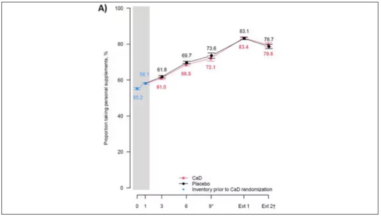
That means, of course, that people in the placebo group, who were getting sugar pills instead of vitamin D and calcium, may have been taking vitamin D and calcium on the side. That would certainly bias the results of the trial toward the null, which is what the primary analyses showed. To wit, the original analysis of the Women’s Health Initiative trial showed no effect of randomization to vitamin D supplementation on improving cancer or cardiovascular outcomes.
But the Women’s Health Initiative trial started 30 years ago. Today, with the benefit of decades of follow-up, we can re-investigate — and perhaps re-litigate — those findings, courtesy of this study, “Long-Term Effect of Randomization to Calcium and Vitamin D Supplementation on Health in Older Women” appearing in Annals of Internal Medicine.
Dr Cynthia Thomson, of the Mel and Enid Zuckerman College of Public Health at the University of Arizona, and colleagues led this updated analysis focused on two findings that had been hinted at, but not statistically confirmed, in other vitamin D studies: a potential for the supplement to reduce the risk for cancer, and a potential for it to increase the risk for heart disease.
The randomized trial itself only lasted 7 years. What we are seeing in this analysis of 36,282 women is outcomes that happened at any time from randomization to the end of 2023 — around 20 years after the randomization to supplementation stopped. But, the researchers would argue, that’s probably okay. Cancer and heart disease take time to develop; we see lung cancer long after people stop smoking. So a history of consistent vitamin D supplementation may indeed be protective — or harmful.
Here are the top-line results. Those randomized to vitamin D and calcium supplementation had a 7% reduction in the rate of death from cancer, driven primarily by a reduction in colorectal cancer. This was statistically significant. Also statistically significant? Those randomized to supplementation had a 6% increase in the rate of death from cardiovascular disease. Put those findings together and what do you get? Stone-cold nothing, in terms of overall mortality.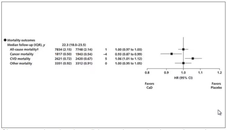
Okay, you say, but what about all that supplementation that was happening outside of the context of the trial, biasing our results toward the null?
The researchers finally clue us in.
First of all, I’ll tell you that, yes, people who were supplementing outside of the trial had higher baseline vitamin D levels — a median of 54.5 nmol/L vs 32.8 nmol/L. This may be because they were supplementing with vitamin D, but it could also be because people who take supplements tend to do other healthy things — another correlation to add to the great cathedral.
To get a better view of the real effects of randomization, the authors restricted the analysis to just those who did not use outside supplements. If vitamin D supplements help, then these are the people they should help. This group had about a 11% reduction in the incidence of cancer — statistically significant — and a 7% reduction in cancer mortality that did not meet the bar for statistical significance.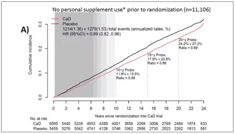
There was no increase in cardiovascular disease among this group. But this small effect on cancer was nowhere near enough to significantly reduce the rate of all-cause mortality.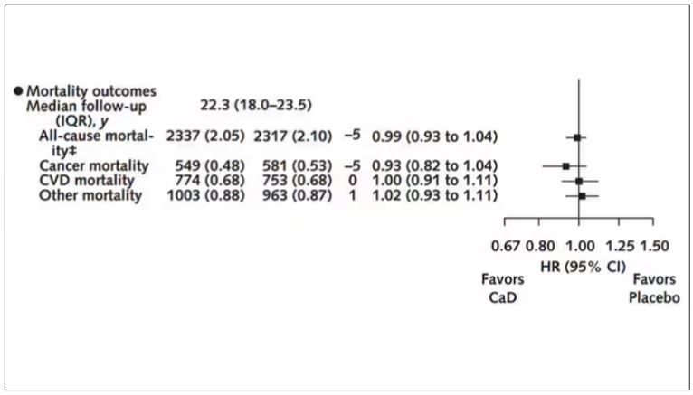
Among those using supplements, vitamin D supplementation didn’t really move the needle on any outcome.
I know what you’re thinking: How many of these women were vitamin D deficient when we got started? These results may simply be telling us that people who have normal vitamin D levels are fine to go without supplementation.
Nearly three fourths of women who were not taking supplements entered the trial with vitamin D levels below the 50 nmol/L cutoff that the authors suggest would qualify for deficiency. Around half of those who used supplements were deficient. And yet, frustratingly, I could not find data on the effect of randomization to supplementation stratified by baseline vitamin D level. I even reached out to Dr Thomson to ask about this. She replied, “We did not stratify on baseline values because the numbers are too small statistically to test this.” Sorry.
In the meantime, I can tell you that for your “average woman,” vitamin D supplementation likely has no effect on mortality. It might modestly reduce the risk for certain cancers while increasing the risk for heart disease (probably through coronary calcification). So, there might be some room for personalization here. Perhaps women with a strong family history of cancer or other risk factors would do better with supplements, and those with a high risk for heart disease would do worse. Seems like a strategy that could be tested in a clinical trial. But maybe we could ask the participants to give up their extracurricular supplement use before they enter the trial. F. Perry Wilson, MD, MSCE, has disclosed no relevant financial relationships.
A version of this article appeared on Medscape.com.
F. Perry Wilson, MD, MSCE, is an associate professor of medicine and public health and director of Yale’s Clinical and Translational Research Accelerator. His science communication work can be found in the Huffington Post, on NPR, and here on Medscape. He tweets @fperrywilson and his book, How Medicine Works and When It Doesn’t, is available now.
COVID-19 Is a Very Weird Virus
This transcript has been edited for clarity.
Welcome to Impact Factor, your weekly dose of commentary on a new medical study. I’m Dr F. Perry Wilson of the Yale School of Medicine.
In the early days of the pandemic, before we really understood what COVID was, two specialties in the hospital had a foreboding sense that something was very strange about this virus. The first was the pulmonologists, who noticed the striking levels of hypoxemia — low oxygen in the blood — and the rapidity with which patients who had previously been stable would crash in the intensive care unit.
The second, and I mark myself among this group, were the nephrologists. The dialysis machines stopped working right. I remember rounding on patients in the hospital who were on dialysis for kidney failure in the setting of severe COVID infection and seeing clots forming on the dialysis filters. Some patients could barely get in a full treatment because the filters would clog so quickly.
We knew it was worse than flu because of the mortality rates, but these oddities made us realize that it was different too — not just a particularly nasty respiratory virus but one that had effects on the body that we hadn’t really seen before.
That’s why I’ve always been interested in studies that compare what happens to patients after COVID infection vs what happens to patients after other respiratory infections. This week, we’ll look at an intriguing study that suggests that COVID may lead to autoimmune diseases like rheumatoid arthritis, lupus, and vasculitis.
The study appears in the Annals of Internal Medicine and is made possible by the universal electronic health record systems of South Korea and Japan, who collaborated to create a truly staggering cohort of more than 20 million individuals living in those countries from 2020 to 2021.
The exposure of interest? COVID infection, experienced by just under 5% of that cohort over the study period. (Remember, there was a time when COVID infections were relatively controlled, particularly in some countries.)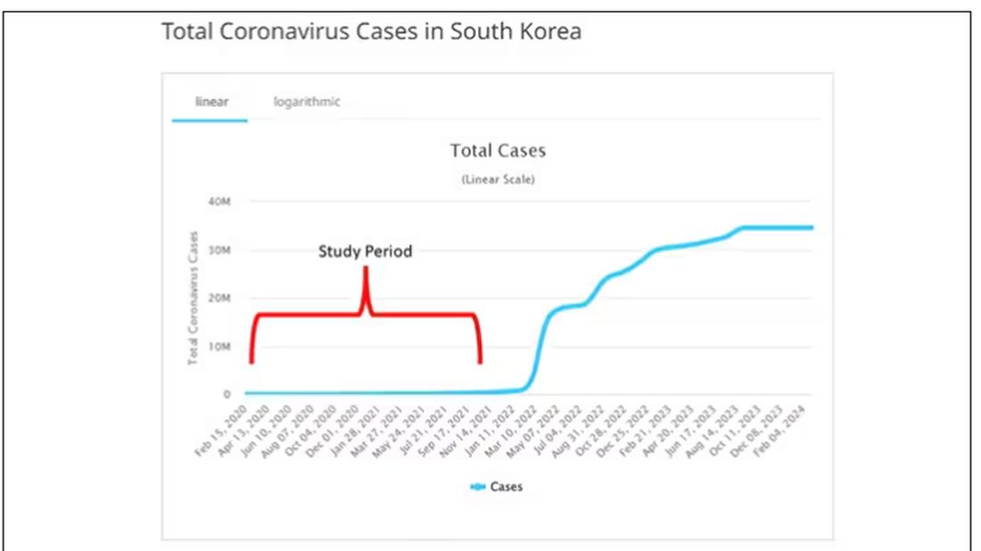
The researchers wanted to compare the risk for autoimmune disease among COVID-infected individuals against two control groups. The first control group was the general population. This is interesting but a difficult analysis, because people who become infected with COVID might be very different from the general population. The second control group was people infected with influenza. I like this a lot better; the risk factors for COVID and influenza are quite similar, and the fact that this group was diagnosed with flu means at least that they are getting medical care and are sort of “in the system,” so to speak.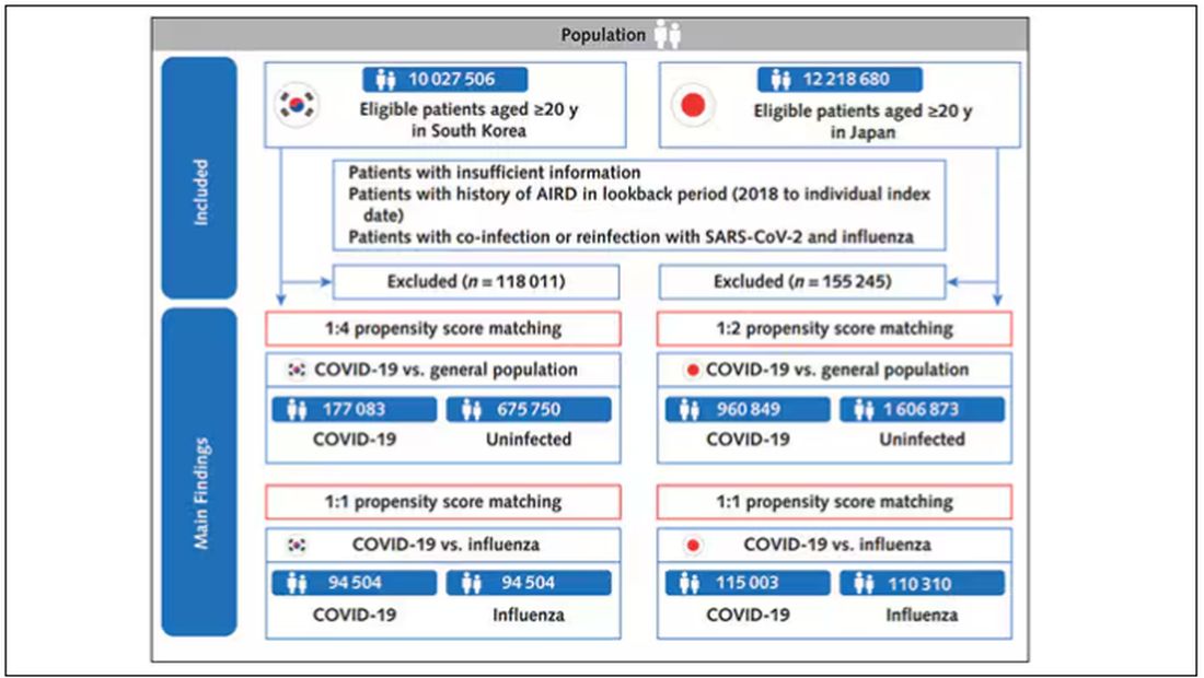
But it’s not enough to simply identify these folks and see who ends up with more autoimmune disease. The authors used propensity score matching to pair individuals infected with COVID with individuals from the control groups who were very similar to them. I’ve talked about this strategy before, but the basic idea is that you build a model predicting the likelihood of infection with COVID, based on a slew of factors — and the slew these authors used is pretty big, as shown below — and then stick people with similar risk for COVID together, with one member of the pair having had COVID and the other having eluded it (at least for the study period).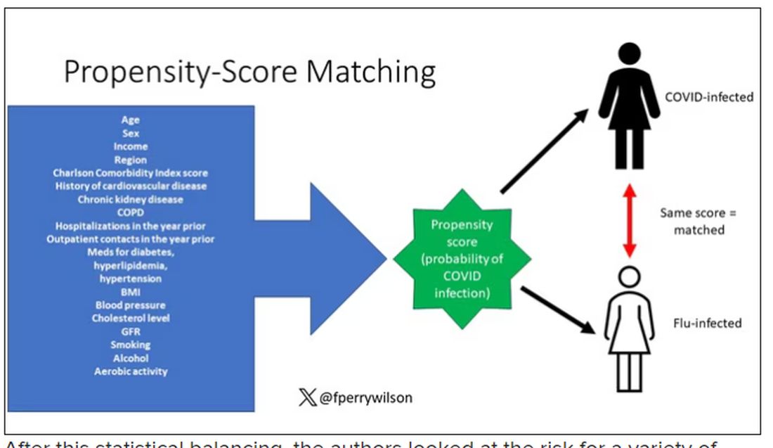
After this statistical balancing, the authors looked at the risk for a variety of autoimmune diseases.
Compared with those infected with flu, those infected with COVID were more likely to be diagnosed with any autoimmune condition, connective tissue disease, and, in Japan at least, inflammatory arthritis.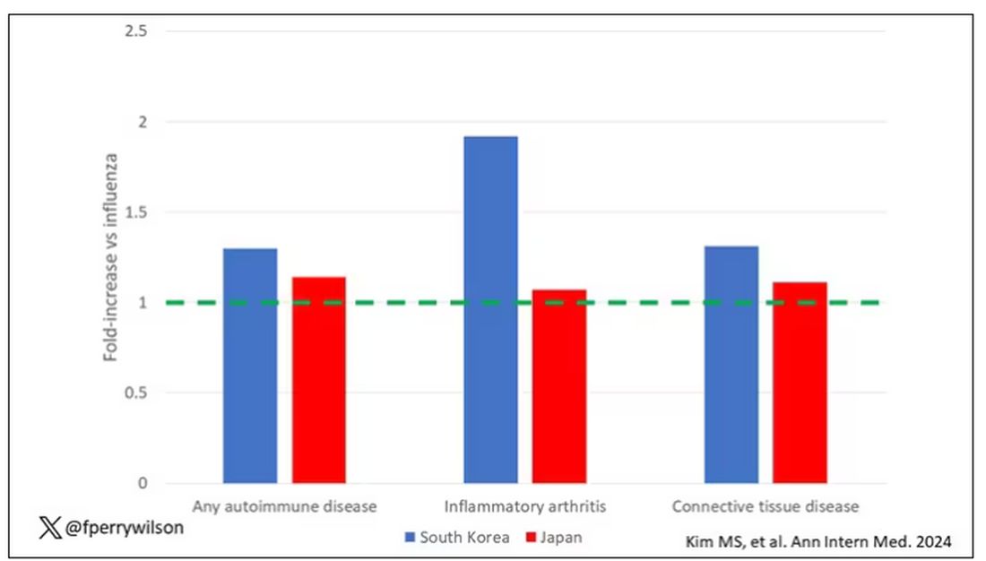
The authors acknowledge that being diagnosed with a disease might not be the same as actually having the disease, so in another analysis they looked only at people who received treatment for the autoimmune conditions, and the signals were even stronger in that group.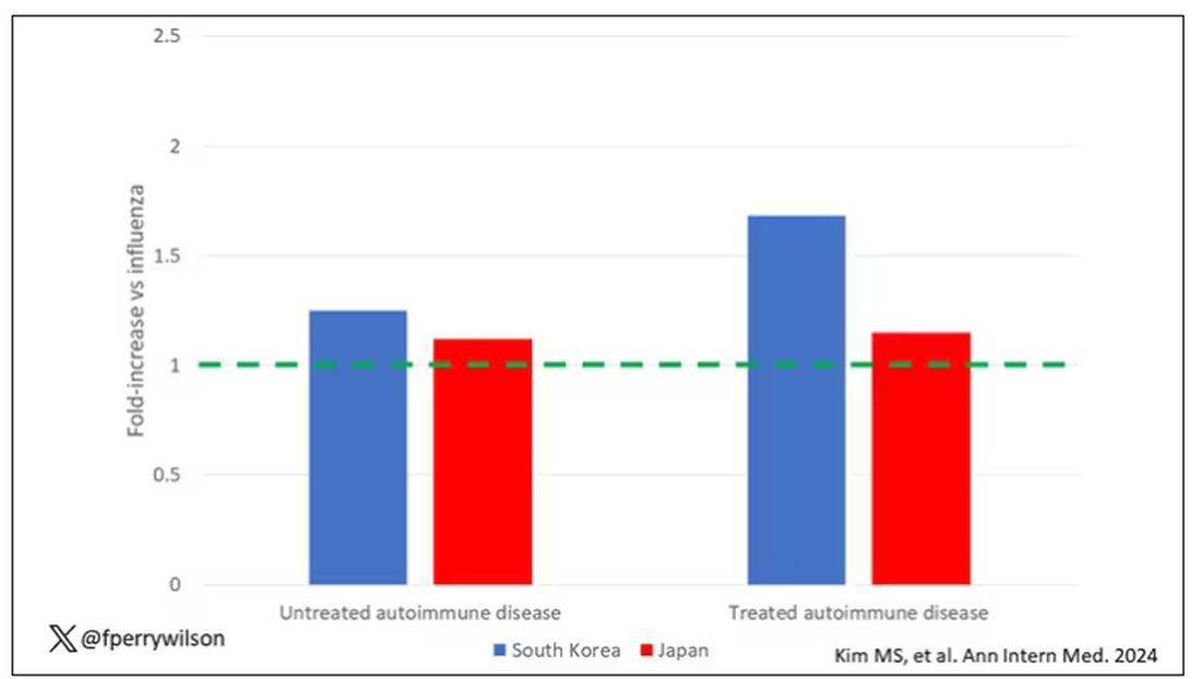
This risk seemed to be highest in the 6 months following the COVID infection, which makes sense biologically if we think that the infection is somehow screwing up the immune system.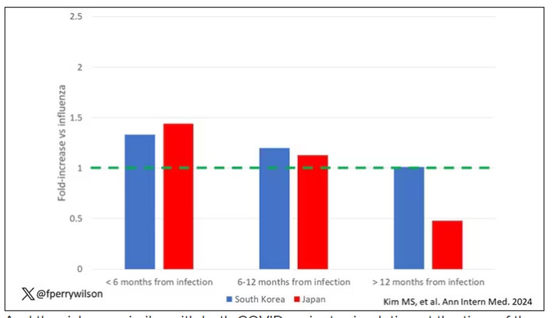
And the risk was similar with both COVID variants circulating at the time of the study.
The only factor that reduced the risk? You guessed it: vaccination. This is a particularly interesting finding because the exposure cohort was defined by having been infected with COVID. Therefore, the mechanism of protection is not prevention of infection; it’s something else. Perhaps vaccination helps to get the immune system in a state to respond to COVID infection more… appropriately?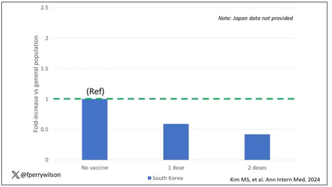
Yes, this study is observational. We can’t draw causal conclusions here. But it does reinforce my long-held belief that COVID is a weird virus, one with effects that are different from the respiratory viruses we are used to. I can’t say for certain whether COVID causes immune system dysfunction that puts someone at risk for autoimmunity — not from this study. But I can say it wouldn’t surprise me.
Dr. F. Perry Wilson is associate professor of medicine and public health and director of the Clinical and Translational Research Accelerator at Yale University, New Haven, Conn. He has disclosed no relevant financial relationships.
A version of this article appeared on Medscape.com.
It Sure Looks Like Cannabis Is Bad for the Heart, Doesn’t It?
This transcript has been edited for clarity.
If you’re an epidemiologist trying to explore whether some exposure is a risk factor for a disease, you can run into a tough problem when your exposure of interest is highly correlated with another risk factor for the disease. For decades, this stymied investigations into the link, if any, between marijuana use and cardiovascular disease because, for decades, most people who used marijuana in some way also smoked cigarettes — which is a very clear risk factor for heart disease.
But the times they are a-changing.
Thanks to the legalization of marijuana for recreational use in many states, and even broader social trends, there is now a large population of people who use marijuana but do not use cigarettes. That means we can start to determine whether marijuana use is an independent risk factor for heart disease.
And this week, we have the largest study yet to attempt to answer that question, though, as I’ll explain momentarily, the smoke hasn’t entirely cleared yet.
The centerpiece of the study we are discussing this week, “Association of Cannabis Use With Cardiovascular Outcomes Among US Adults,” which appeared in the Journal of the American Heart Association, is the Behavioral Risk Factor Surveillance System, an annual telephone survey conducted by the Centers for Disease Control and Prevention since 1984 that gathers data on all sorts of stuff that we do to ourselves: our drinking habits, our smoking habits, and, more recently, our marijuana habits.
The paper combines annual data from 2016 to 2020 representing 27 states and two US territories for a total sample size of more than 430,000 individuals. The key exposure? Marijuana use, which was coded as the number of days of marijuana use in the past 30 days. The key outcome? Coronary heart disease, collected through questions such as “Has a doctor, nurse, or other health professional ever told you that you had a heart attack?”
Right away you might detect a couple of problems here. But let me show you the results before we worry about what they mean.
You can see the rates of the major cardiovascular outcomes here, stratified by daily use of marijuana, nondaily use, and no use. Broadly speaking, the risk was highest for daily users, lowest for occasional users, and in the middle for non-users.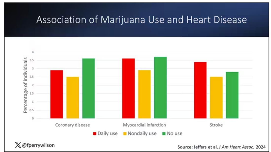
Of course, non-users and users are different in lots of other ways; non-users were quite a bit older, for example. Adjusting for all those factors showed that, independent of age, smoking status, the presence of diabetes, and so on, there was an independently increased risk for cardiovascular outcomes in people who used marijuana.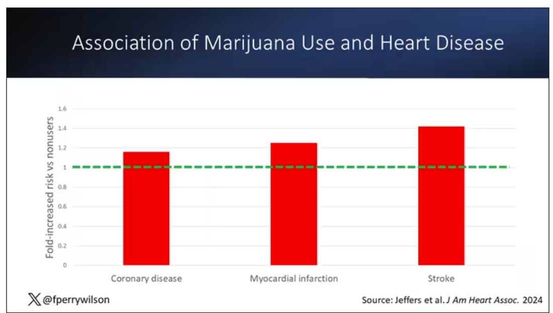
Importantly, 60% of people in this study were never smokers, and the results in that group looked pretty similar to the results overall.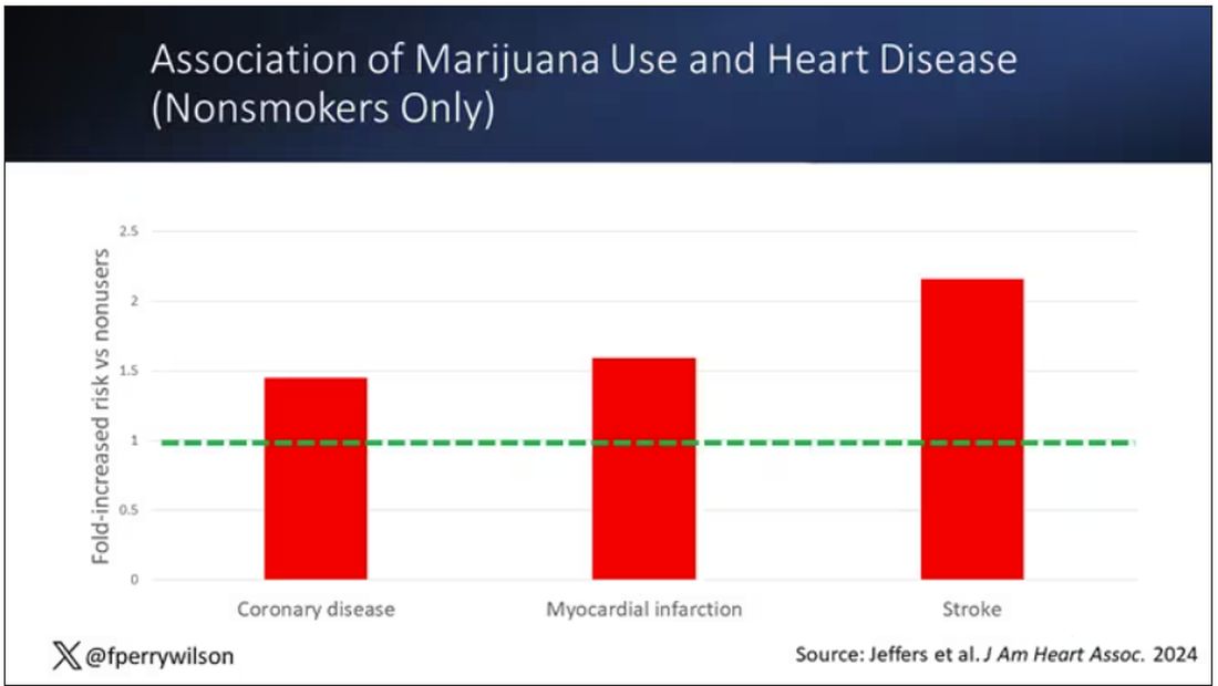
But I said there were a couple of problems, so let’s dig into those a bit.
First, like most survey studies, this one requires honest and accurate reporting from its subjects. There was no verification of heart disease using electronic health records or of marijuana usage based on biosamples. Broadly, miscategorization of exposure and outcomes in surveys tends to bias the results toward the null hypothesis, toward concluding that there is no link between exposure and outcome, so perhaps this is okay.
The bigger problem is the fact that this is a cross-sectional design. If you really wanted to know whether marijuana led to heart disease, you’d do a longitudinal study following users and non-users for some number of decades and see who developed heart disease and who didn’t. (For the pedants out there, I suppose you’d actually want to randomize people to use marijuana or not and then see who had a heart attack, but the IRB keeps rejecting my protocol when I submit it.)
Here, though, we literally can’t tell whether people who use marijuana have more heart attacks or whether people who have heart attacks use more marijuana. The authors argue that there are no data that show that people are more likely to use marijuana after a heart attack or stroke, but at the time the survey was conducted, they had already had their heart attack or stroke.
The authors also imply that they found a dose-response relationship between marijuana use and these cardiovascular outcomes. This is an important statement because dose response is one factor that we use to determine whether a risk factor may actually be causative as opposed to just correlative.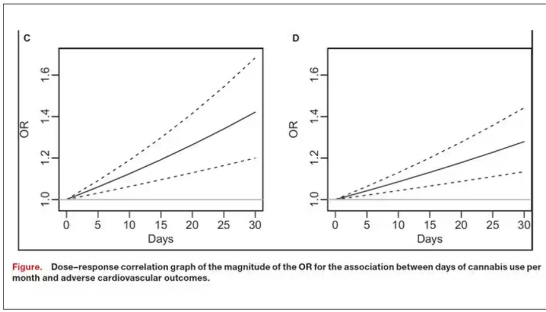
But I take issue with the dose-response language here. The model used to make these graphs classifies marijuana use as a single continuous variable ranging from 0 (no days of use in the past 30 days) to 1 (30 days of use in the past 30 days). The model is thus constrained to monotonically increase or decrease with respect to the outcome. To prove a dose response, you have to give the model the option to find something that isn’t a dose response — for example, by classifying marijuana use into discrete, independent categories rather than a single continuous number.
Am I arguing here that marijuana use is good for you? Of course not. Nor am I even arguing that it has no effect on the cardiovascular system. There are endocannabinoid receptors all over your vasculature. But a cross-sectional survey study, while a good start, is not quite the right way to answer the question. So, while the jury is still out, it’s high time for more research.
Dr. F. Perry Wilson is associate professor of medicine and public health and director of the Clinical and Translational Research Accelerator at Yale University, New Haven, Connecticut. He has disclosed no relevant financial relationships.
A version of this article appeared on Medscape.com.
Bivalent Vaccines Protect Even Children Who’ve Had COVID
This transcript has been edited for clarity.
It was only 3 years ago when we called the pathogen we now refer to as the coronavirus “nCOV-19.” It was, in many ways, more descriptive than what we have today. The little “n” there stood for “novel” — and it was really that little “n” that caused us all the trouble.
You see, coronaviruses themselves were not really new to us. Understudied, perhaps, but with four strains running around the globe at any time giving rise to the common cold, these were viruses our bodies understood.
But Instead of acting like a cold, it acted like nothing we had seen before, at least in our lifetime. The story of the pandemic is very much a bildungsroman of our immune systems — a story of how our immunity grew up.
The difference between the start of 2020 and now, when infections with the coronavirus remain common but not as deadly, can be measured in terms of immune education. Some of our immune systems were educated by infection, some by vaccination, and many by both.
When the first vaccines emerged in December 2020, the opportunity to educate our immune systems was still huge. Though, at the time, an estimated 20 million had been infected in the US and 350,000 had died, there was a large population that remained immunologically naive. I was one of them.
If 2020 into early 2021 was the era of immune education, the postvaccine period was the era of the variant. From one COVID strain to two, to five, to innumerable, our immune memory — trained on a specific version of the virus or its spike protein — became imperfect again. Not naive; these variants were not “novel” in the way COVID-19 was novel, but they were different. And different enough to cause infection.
Following the playbook of another virus that loves to come dressed up in different outfits, the flu virus, we find ourselves in the booster era — a world where yearly doses of a vaccine, ideally matched to the variants circulating when the vaccine is given, are the recommendation if not the norm.
But questions remain about the vaccination program, particularly around who should get it. And two populations with big question marks over their heads are (1) people who have already been infected and (2) kids, because their risk for bad outcomes is so much lower.
This week, we finally have some evidence that can shed light on these questions. The study under the spotlight is this one, appearing in JAMA, which tries to analyze the ability of the bivalent vaccine — that’s the second one to come out, around September 2022 — to protect kids from COVID-19.
Now, right off the bat, this was not a randomized trial. The studies that established the viability of the mRNA vaccine platform were; they happened before the vaccine was authorized. But trials of the bivalent vaccine were mostly limited to proving immune response, not protection from disease.
Nevertheless, with some good observational methods and some statistics, we can try to tease out whether bivalent vaccines in kids worked.
The study combines three prospective cohort studies. The details are in the paper, but what you need to know is that the special sauce of these studies was that the kids were tested for COVID-19 on a weekly basis, whether they had symptoms or not. This is critical because asymptomatic infections can transmit COVID-19.
Let’s do the variables of interest. First and foremost, the bivalent vaccine. Some of these kids got the bivalent vaccine, some didn’t. Other key variables include prior vaccination with the monovalent vaccine. Some had been vaccinated with the monovalent vaccine before, some hadn’t. And, of course, prior infection. Some had been infected before (based on either nasal swabs or blood tests).
Let’s focus first on the primary exposure of interest: getting that bivalent vaccine. Again, this was not randomly assigned; kids who got the bivalent vaccine were different from those who did not. In general, they lived in smaller households, they were more likely to be White, less likely to have had a prior COVID infection, and quite a bit more likely to have at least one chronic condition.
To me, this constellation of factors describes a slightly higher-risk group; it makes sense that they were more likely to get the second vaccine.
Given those factors, what were the rates of COVID infection? After nearly a year of follow-up, around 15% of the kids who hadn’t received the bivalent vaccine got infected compared with 5% of the vaccinated kids. Symptomatic infections represented roughly half of all infections in both groups.
After adjustment for factors that differed between the groups, this difference translated into a vaccine efficacy of about 50% in this population. That’s our first data point. Yes, the bivalent vaccine worked. Not amazingly, of course. But it worked.
What about the kids who had had a prior COVID infection? Somewhat surprisingly, the vaccine was just as effective in this population, despite the fact that their immune systems already had some knowledge of COVID. Ten percent of unvaccinated kids got infected, even though they had been infected before. Just 2.5% of kids who received the bivalent vaccine got infected, suggesting some synergy between prior infection and vaccination.
These data suggest that the bivalent vaccine did reduce the risk for COVID infection in kids. All good. But the piece still missing is how severe these infections were. It doesn’t appear that any of the 426 infections documented in this study resulted in hospitalization or death, fortunately. And no data are presented on the incidence of multisystem inflammatory syndrome of children, though given the rarity, I’d be surprised if any of these kids have this either.
So where are we? Well, it seems that the narrative out there that says “the vaccines don’t work” or “the vaccines don’t work if you’ve already been infected” is probably not true. They do work. This study and others in adults show that. If they work to reduce infections, as this study shows, they will also work to reduce deaths. It’s just that death is fortunately so rare in children that the number needed to vaccinate to prevent one death is very large. In that situation, the decision to vaccinate comes down to the risks associated with vaccination. So far, those risk seem very minimal.
Perhaps falling into a flu-like yearly vaccination schedule is not simply the result of old habits dying hard. Maybe it’s actually not a bad idea.
Dr. F. Perry Wilson is associate professor of medicine and public health and director of the Clinical and Translational Research Accelerator at Yale University, New Haven, Conn. He has disclosed no relevant financial relationships.
A version of this article appeared on Medscape.com.
More Young Women Being Diagnosed With Breast Cancer Than Ever Before
This transcript has been edited for clarity.
From the year 2000 until around 2016, the incidence of breast cancer among young women — those under age 50 — rose steadily, if slowly.
And then this happened:
I look at a lot of graphs in my line of work, and it’s not too often that one actually makes me say “What the hell?” out loud. But this one did. Why are young women all of a sudden more likely to get breast cancer?
The graph comes from this paper, Breast cancer incidence among us women aged 20 to 49 years by race, stage, and hormone receptor status, appearing in JAMA Network Open
Researchers from Washington University in St. Louis utilized SEER registries to conduct their analyses. SEER is a public database from the National Cancer Institute with coverage of 27% of the US population and a long track record of statistical backbone to translate the data from SEER to numbers that are representative of the population at large.
From 2000 to 2019, more than 200,000 women were diagnosed with primary invasive breast cancer in the dataset, and I’ve already given you the top-line results. Of course, when you see a graph like this, the next question really needs to be why?
Fortunately, the SEER dataset contains a lot more information than simply whether someone was diagnosed with cancer. In the case of breast cancer, there is information about the patient’s demographics, the hormone status of the cancer, the stage, and so on. Using those additional data points can help the authors, and us, start to formulate some hypotheses as to what is happening here.
Let’s start with something a bit tricky about this kind of data. We see an uptick in new breast cancer diagnoses among young women in recent years. We need to tease that uptick apart a bit. It could be that it is the year that is the key factor here. In other words, it is simply that more women are getting breast cancer since 2016 and so more young women are getting breast cancer since 2016. These are known as period effects.
Or is there something unique to young women — something about their environmental exposures that put them at higher risk than they would have been had they been born at some other time? These are known as cohort effects.
The researchers teased these two effects apart, as you can see here, and concluded that, well, it’s both.
Stage of cancer at diagnosis can give us some more insight into what is happening. These results are pretty interesting. These higher cancer rates are due primarily to stage I and stage IV cancers, not stage II and stage III cancers.
The rising incidence of stage I cancers could reflect better detection, though many of the women in this cohort would not have been old enough to quality for screening mammograms. That said, increased awareness about genetic risk and family history might be leading younger women to get screened, picking up more early cancers. Additionally, much of the increased incidence was with estrogen receptor–positive tumors, which might reflect the fact that women in this cohort are tending to have fewer children, and children later in life.
So why the rise in stage IV breast cancer? Well, precisely because younger women are not recommended to get screening mammograms; those who detect a lump on their own are likely to be at a more advanced stage. But I’m not sure why that would be changing recently. The authors argue that an increase in overweight and obesity in the country might be to blame here. Prior studies have shown that higher BMI is associated with higher stage at breast cancer diagnosis.
Of course, we can speculate as to multiple other causes as well: environmental toxins, pollution, hormone exposures, and so on. Figuring this out will be the work of multiple other studies. In the meantime, we should remember that the landscape of cancer is continuously changing. And that means we need to adapt to it. If these trends continue, national agencies may need to reconsider their guidelines for when screening mammography should begin — at least in some groups of young women.
Dr. F. Perry Wilson is associate professor of medicine and public health and director of the Clinical and Translational Research Accelerator at Yale University, New Haven, Conn. He has disclosed no relevant financial relationships.
A version of this article appeared on Medscape.com.
Even Intentional Weight Loss Linked With Cancer
This transcript has been edited for clarity.
As anyone who has been through medical training will tell you, some little scenes just stick with you. I had been seeing a patient in our resident clinic in West Philly for a couple of years. She was in her mid-60s with diabetes and hypertension and a distant smoking history. She was overweight and had been trying to improve her diet and lose weight since I started seeing her. One day she came in and was delighted to report that she had finally started shedding some pounds — about 15 in the past 2 months.
I enthusiastically told my preceptor that my careful dietary counseling had finally done the job. She looked through the chart for a moment and asked, “Is she up to date on her cancer screening?” A workup revealed adenocarcinoma of the lung. The patient did well, actually, but the story stuck with me.
The textbooks call it “unintentional weight loss,” often in big, scary letters, and every doctor will go just a bit pale if a patient tells them that, despite efforts not to, they are losing weight. But true unintentional weight loss is not that common. After all, most of us are at least half-heartedly trying to lose weight all the time. Should doctors be worried when we are successful?
A new study suggests that perhaps they should. We’re talking about this study, appearing in JAMA, which combined participants from two long-running observational cohorts: 120,000 women from the Nurses’ Health Study, and 50,000 men from the Health Professionals Follow-Up Study. (These cohorts started in the 1970s and 1980s, so we’ll give them a pass on the gender-specific study designs.)
The rationale of enrolling healthcare providers in these cohort studies is that they would be reliable witnesses of their own health status. If a nurse or doctor says they have pancreatic cancer, it’s likely that they truly have pancreatic cancer. Detailed health surveys were distributed to the participants every other year, and the average follow-up was more than a decade.
Participants recorded their weight — as an aside, a nested study found that self-reported rate was extremely well correlated with professionally measured weight — and whether they had received a cancer diagnosis since the last survey.
This allowed researchers to look at the phenomenon described above. Would weight loss precede a new diagnosis of cancer? And, more interestingly, would intentional weight loss precede a new diagnosis of cancer.
I don’t think it will surprise you to hear that individuals in the highest category of weight loss, those who lost more than 10% of their body weight over a 2-year period, had a larger risk of being diagnosed with cancer in the next year. That’s the yellow line in this graph. In fact, they had about a 40% higher risk than those who did not lose weight.
Increased risk was found across multiple cancer types, though cancers of the gastrointestinal tract, not surprisingly, were most strongly associated with antecedent weight loss.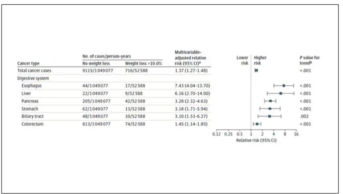
What about intentionality of weight loss? Unfortunately, the surveys did not ask participants whether they were trying to lose weight. Rather, the surveys asked about exercise and dietary habits. The researchers leveraged these responses to create three categories of participants: those who seemed to be trying to lose weight (defined as people who had increased their exercise and dietary quality); those who didn’t seem to be trying to lose weight (they changed neither exercise nor dietary behaviors); and a middle group, which changed one or the other of these behaviors but not both.
Let’s look at those who really seemed to be trying to lose weight. Over 2 years, they got more exercise and improved their diet.
If they succeeded in losing 10% or more of their body weight, they still had a higher risk for cancer than those who had not lost weight — about 30% higher, which is not that different from the 40% increased risk when you include those folks who weren’t changing their lifestyle.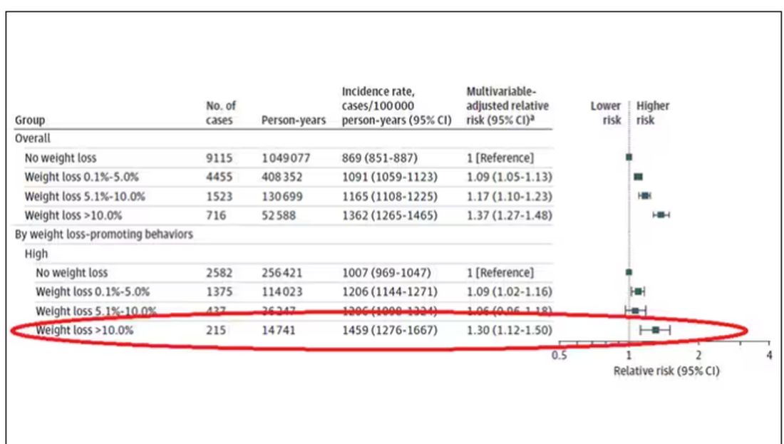
This is why this study is important. The classic teaching is that unintentional weight loss is a bad thing and needs a workup. That’s fine. But we live in a world where perhaps the majority of people are, at any given time, trying to lose weight.
We need to be careful here. I am not by any means trying to say that people who have successfully lost weight have cancer. Both of the following statements can be true:
Significant weight loss, whether intentional or not, is associated with a higher risk for cancer.
Most people with significant weight loss will not have cancer.
Both of these can be true because cancer is, fortunately, rare. Of people who lose weight, the vast majority will lose weight because they are engaging in healthier behaviors. A small number may lose weight because something else is wrong. It’s just hard to tell the two apart.
Out of the nearly 200,000 people in this study, only around 16,000 developed cancer during follow-up. Again, although the chance of having cancer is slightly higher if someone has experienced weight loss, the chance is still very low.
We also need to avoid suggesting that weight loss causes cancer. Some people lose weight because of an existing, as of yet undiagnosed cancer and its metabolic effects. This is borne out if you look at the risk of being diagnosed with cancer as you move further away from the interval of weight loss.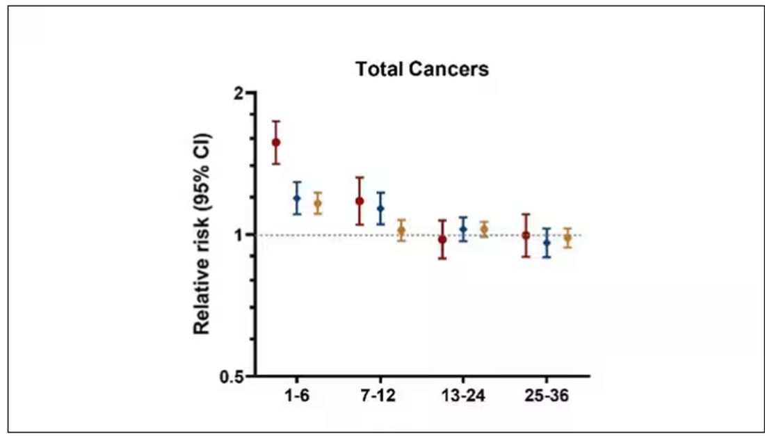
The further you get from the year of that 10% weight loss, the less likely you are to be diagnosed with cancer. Most of these cancers are diagnosed within a year of losing weight. In other words, if you’re reading this and getting worried that you lost weight 10 years ago, you’re probably out of the woods. That was, most likely, just you getting healthier.
Last thing: We have methods for weight loss now that are way more effective than diet or exercise. I’m looking at you, Ozempic. But aside from the weight loss wonder drugs, we have surgery and other interventions. This study did not capture any of that data. Ozempic wasn’t even on the market during this study, so we can’t say anything about the relationship between weight loss and cancer among people using nonlifestyle mechanisms to lose weight.
It’s a complicated system. But the clinically actionable point here is to notice if patients have lost weight. If they’ve lost it without trying, further workup is reasonable. If they’ve lost it but were trying to lose it, tell them “good job.” And consider a workup anyway.
Dr. Wilson is associate professor of medicine and public health and director of the Clinical and Translational Research Accelerator at Yale University, New Haven, Conn. He has disclosed no relevant financial relationships.
A version of this article appeared on Medscape.com.
Testosterone Replacement May Cause ... Fracture?
This transcript has been edited for clarity.
I am showing you a graph without any labels.
What could this line represent? The stock price of some company that made a big splash but failed to live up to expectations? An outbreak curve charting the introduction of a new infectious agent to a population? The performance of a viral tweet?
I’ll tell you what it is in a moment, but I wanted you to recognize that there is something inherently wistful in this shape, something that speaks of past glory and inevitable declines. It’s a graph that induces a feeling of resistance — no, do not go gently into that good night.
The graph actually represents (roughly) the normal level of serum testosterone in otherwise-healthy men as they age.
A caveat here: These numbers are not as well defined as I made them seem on this graph, particularly for those older than 65 years. But it is clear that testosterone levels decline with time, and the idea to supplement testosterone is hardly new. Like all treatments, testosterone supplementation has risks and benefits. Some risks are predictable, like exacerbating the symptoms of benign prostatic hyperplasia. Some risks seem to come completely out of left field. That’s what we have today, in a study suggesting that testosterone supplementation increases the risk for bone fractures.
Let me set the stage here by saying that nearly all prior research into the effects of testosterone supplementation has suggested that it is pretty good for bone health. It increases bone mineral density, bone strength, and improves bone architecture.
So if you were to do a randomized trial of testosterone supplementation and look at fracture risk in the testosterone group compared with the placebo group, you would expect the fracture risk would be much lower in those getting supplemented. Of course, this is why we actually do studies instead of assuming we know the answer already — because in this case, you’d be wrong.
I’m talking about this study, appearing in The New England Journal of Medicine.
It’s a prespecified secondary analysis of a randomized trial known as the TRAVERSE trial, which randomly assigned 5246 men with low testosterone levels to transdermal testosterone gel vs placebo. The primary goal of that trial was to assess the cardiovascular risk associated with testosterone supplementation, and the major take-home was that there was no difference in cardiovascular event rates between the testosterone and placebo groups.
This secondary analysis looked at fracture incidence. Researchers contacted participants multiple times in the first year of the study and yearly thereafter. Each time, they asked whether the participant had sustained a fracture. If they answered in the affirmative, a request for medical records was made and the researchers, still blinded to randomization status, adjudicated whether there was indeed a fracture or not, along with some details as to location, situation, and so on.
This was a big study, though, and that translates to just a 3.5% fracture rate in testosterone vs 2.5% in control, but the difference was statistically significant.
This difference persisted across various fracture types (non–high-impact fractures, for example) after excluding the small percentage of men taking osteoporosis medication.
How does a drug that increases bone mineral density and bone strength increase the risk for fracture?
Well, one clue — and this was pointed out in a nice editorial by Matthis Grossman and Bradley Anawalt — is that the increased risk for fracture occurs quite soon after starting treatment, which is not consistent with direct bone effects. Rather, this might represent behavioral differences. Testosterone supplementation seems to increase energy levels; might it lead men to engage in activities that put them at higher risk for fracture?
Regardless of the cause, this adds to our knowledge about the rather complex mix of risks and benefits of testosterone supplementation and probably puts a bit more weight on the risks side. The truth is that testosterone levels do decline with age, as do many things, and it may not be appropriate to try to fight against that in all people. It’s worth noting that all of these studies use low levels of total serum testosterone as an entry criterion. But total testosterone is not what your body “sees.” It sees free testosterone, the portion not bound to sex hormone–binding globulin. And that binding protein is affected by lots of stuff — diabetes and obesity lower it, for example — making total testosterone levels seem low when free testosterone might be just fine.
In other words, testosterone supplementation is probably not terrible, but it is definitely not the cure for aging. In situations like this, we need better data to guide exactly who will benefit from the therapy and who will only be exposed to the risks.
Dr. Wilson is associate professor of medicine and public health and director of the Clinical and Translational Research Accelerator at Yale University, New Haven, Conn. He has disclosed no relevant financial relationships.
A version of this article appeared on Medscape.com.
Yes, Patients Are Getting More Complicated
This transcript has been edited for clarity.
The first time I saw a patient in the hospital was in 2004, twenty years ago, when I was a third-year med student. I mean, look at that guy. The things I could tell him.
Since that time, I have spent countless hours in the hospital as a resident, a renal fellow, and finally as an attending. And I’m sure many of you in the medical community feel the same thing I do, which is that patients are much more complicated now than they used to be. I’ll listen to an intern present a new case on rounds and she’ll have an assessment and plan that encompasses a dozen individual medical problems. Sometimes I have to literally be like, “Wait, why is this patient here again?”
But until now, I had no data to convince myself that this feeling was real — that hospitalized patients are getting more and more complicated, or that they only seem more complicated because I’m getting older. Maybe I was better able to keep track of things when I was an intern rather than now as an attending, spending just a couple months of the year in the hospital. I mean, after all, if patients were getting more complicated, surely hospitals would know this and allocate more resources to patient care, right?
Right?
It’s not an illusion. At least not according to this paper, Population-Based Trends in Complexity of Hospital Inpatients, appearing in JAMA Internal Medicine, which examines about 15 years of inpatient hospital admissions in British Columbia.
I like Canada for this study for two reasons: First, their electronic health record system is province-wide, so they don’t have issues of getting data from hospital A vs hospital B. All the data are there — in this case, more than 3 million nonelective hospital admissions from British Columbia. Second, there is universal healthcare. We don’t have to worry about insurance companies changing, or the start of a new program like the Affordable Care Act. It’s just a cleaner set-up.
Of course, complexity is hard to define, and the authors here decide to look at a variety of metrics I think we can agree are tied into complexity. These include things like patient age, comorbidities, medications, frequency of hospitalization, and so on. They also looked at outcomes associated with hospitalization: Did the patient require the ICU? Did they survive? Were they readmitted?
And the tale of the tape is as clear as that British Columbian air: Over the past 15 years, your average hospitalized patient is about 3 years older, is twice as likely to have kidney disease, 70% more likely to have diabetes, is on more medications (particularly anticoagulants), and is much more likely to be admitted through the emergency room. They’ve also spent more time in the hospital in the past year.
Given the increased complexity, you might expect that the outcomes for these patients are worse than years ago, but the data do not bear that out. In fact, inpatient mortality is lower now than it was 15 years ago, although 30-day postdischarge mortality is higher. Put those together and it turns out that death rates are pretty stable: 9% of people admitted for nonelective reasons to the hospital will die within 30 days. It’s just that nowadays, we tend to discharge them before that happens.
Why are our patients getting more complex? Some of it is demographics; the population is aging, after all. Some of it relates to the increasing burden of comorbidities like diabetes and kidney disease, which are associated with the obesity epidemic. But in some ways, we’re a victim of our own success.
Given all that, does it make any sense that many of our hospitals are at skeleton-crew staffing levels? That hospitalists report taking care of more patients than they ever have before?
There’s been so much talk about burnout in the health professions lately. Maybe something people need to start acknowledging — particularly those who haven’t practiced on the front lines for a decade or two — is that the job is, quite simply, harder now. As patients become more complex, we need more resources, human and otherwise, to care for them.
F. Perry Wilson, MD, MSCE, is an associate professor of medicine and public health and director of Yale’s Clinical and Translational Research Accelerator. His science communication work can be found in the Huffington Post, on NPR, and here on Medscape. He tweets @fperrywilson and his book, How Medicine Works and When It Doesn’t, is available now. He has disclosed no relevant financial relationships.
A version of this article appeared on Medscape.com.